ventana store
When our client came to us, it was with a brief not simply to showcase high-end aluminium and timber doors, windows and timber building products, but rather to create a space that would be so open, light, airy and permeable that it could serve to inspire the designers and clients that they intended to welcome here. Our initial response therefore was to railagainstthe way we have seen these “showrooms” typically laid out i.e. with doors and windows stacked in frames nearly back-to-back in internal space with no context. To this end, we were lucky to have an interior space that was open on three sides and so naturally used this to place windows where they belong – within external walls (rather than in the middle of a room).
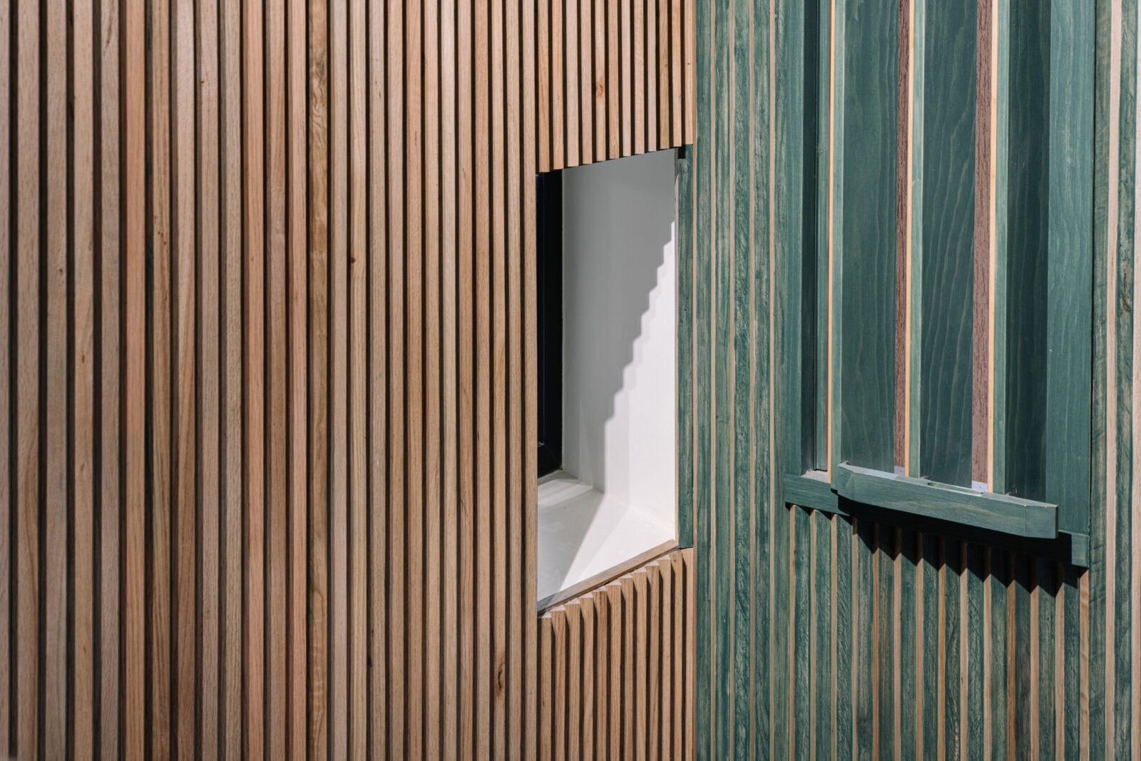
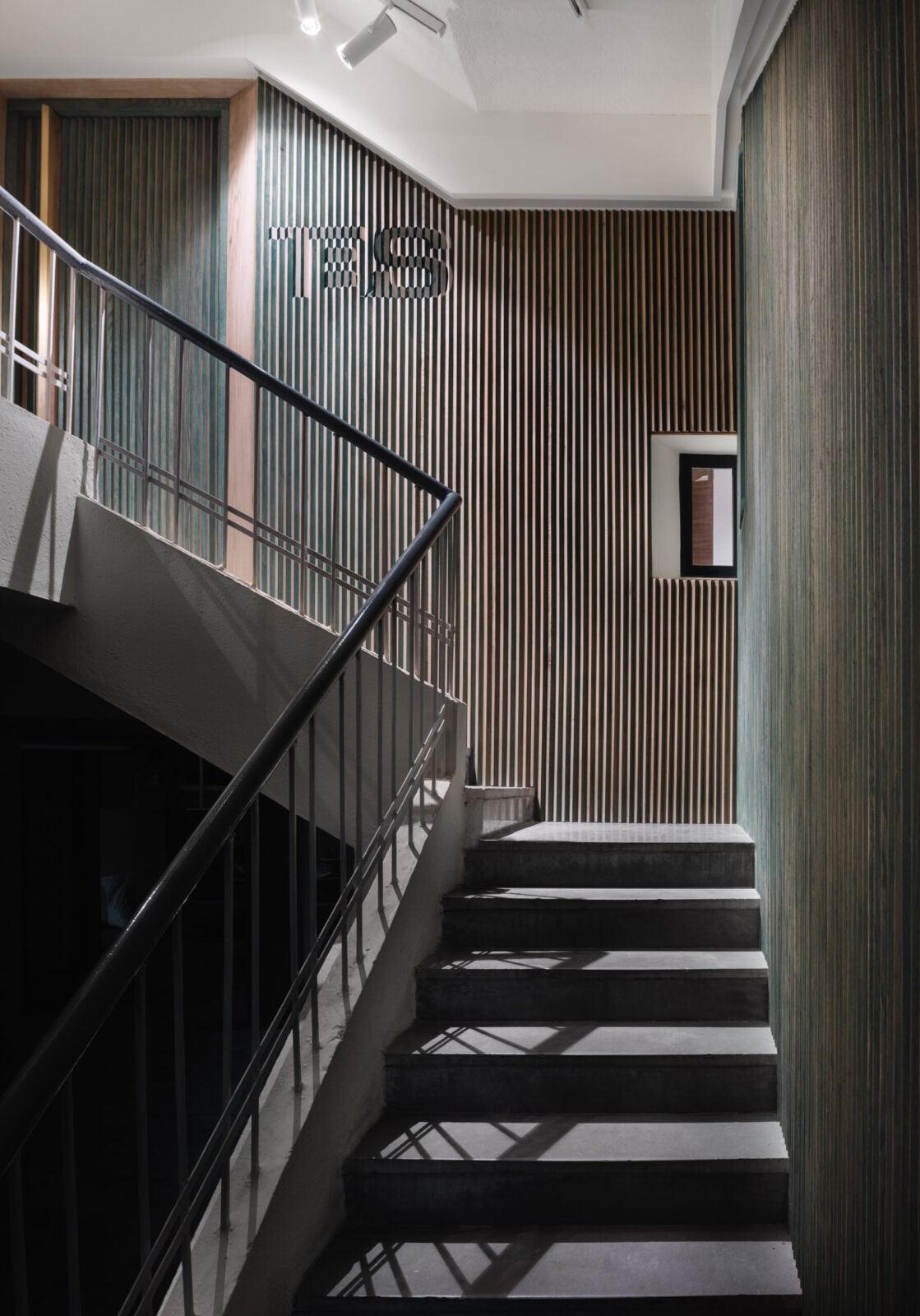
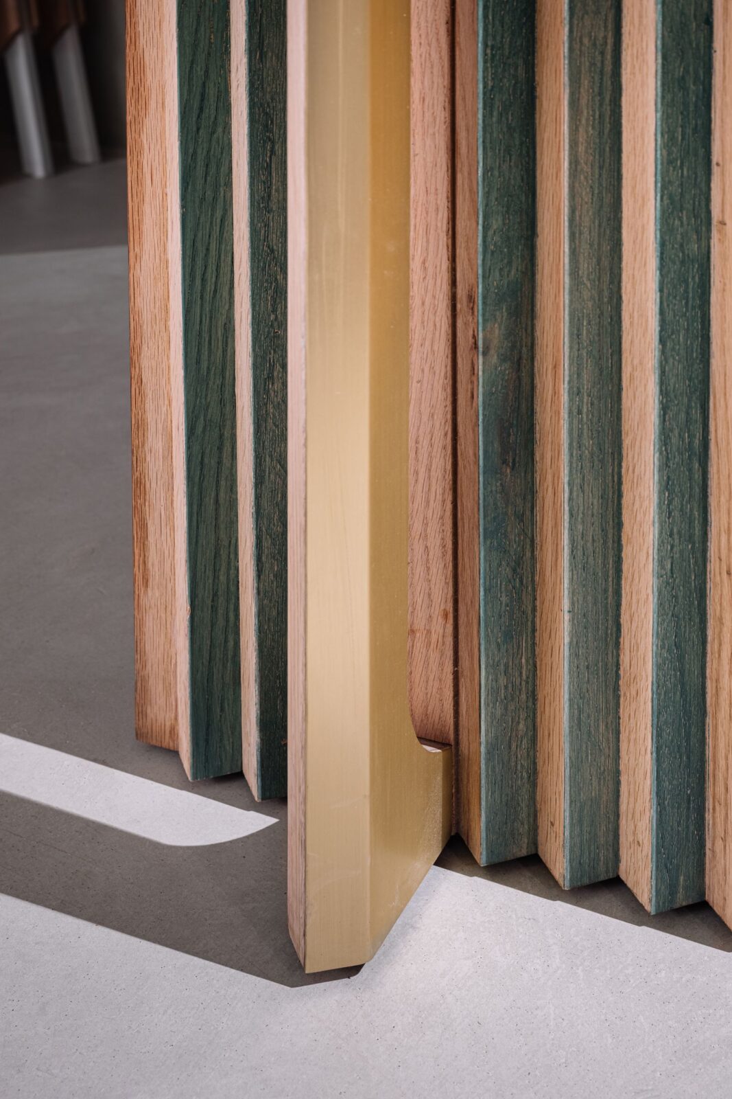
At the start of the approach stair from ground to first floor where the gallery is located, it is clear that this is not a conventional showroom. Triangular timber fins clad the walls and make use of an visual illusioncalled lenticular optics where what is seen depends on one’s point of view, such that the signage is initially seen as green artwork against a light oak backdrop, but changes as one moves to the opposite i.e. light oak artwork on a green backdrop.
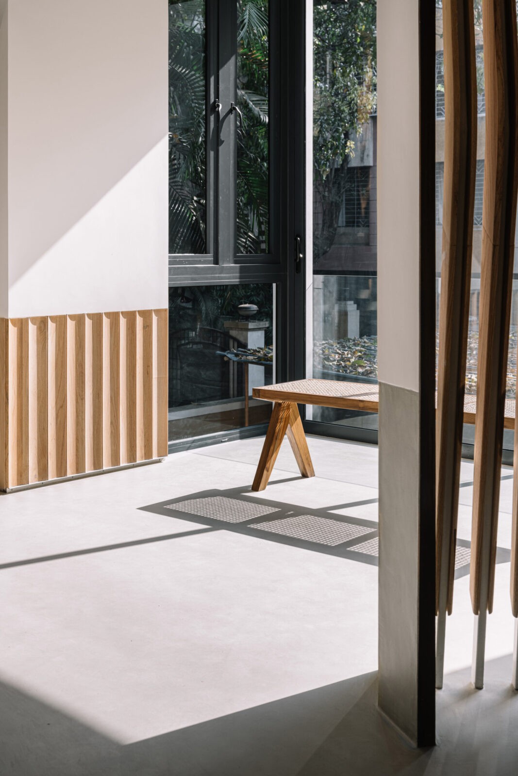
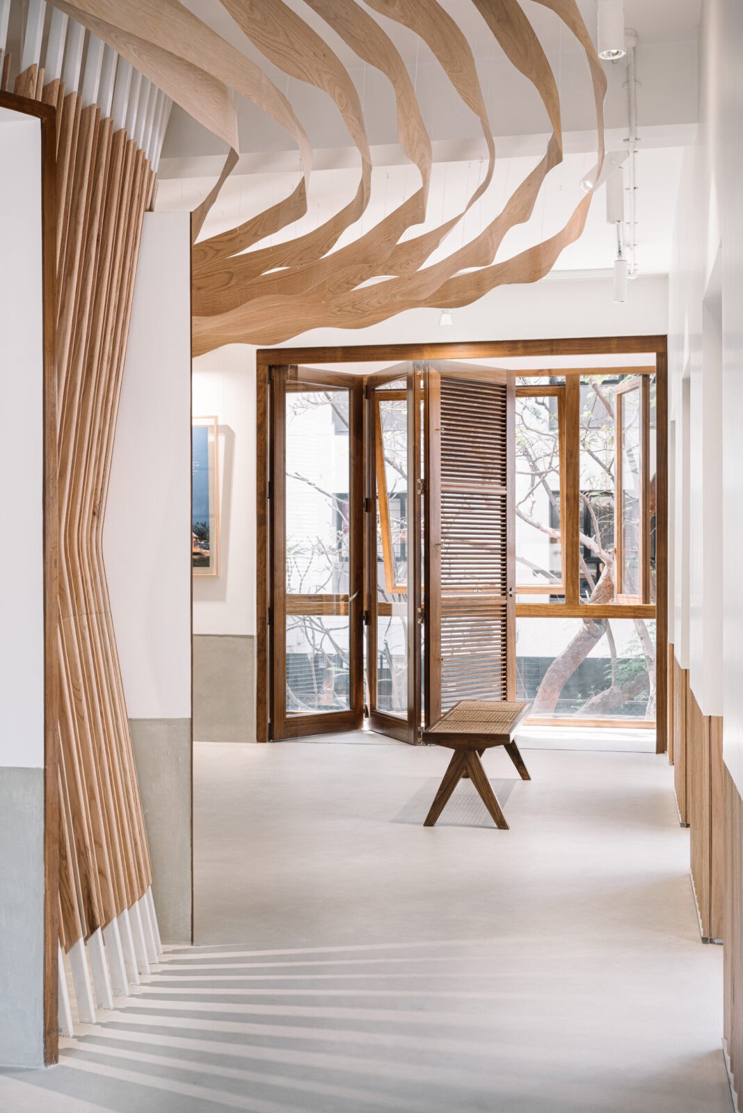
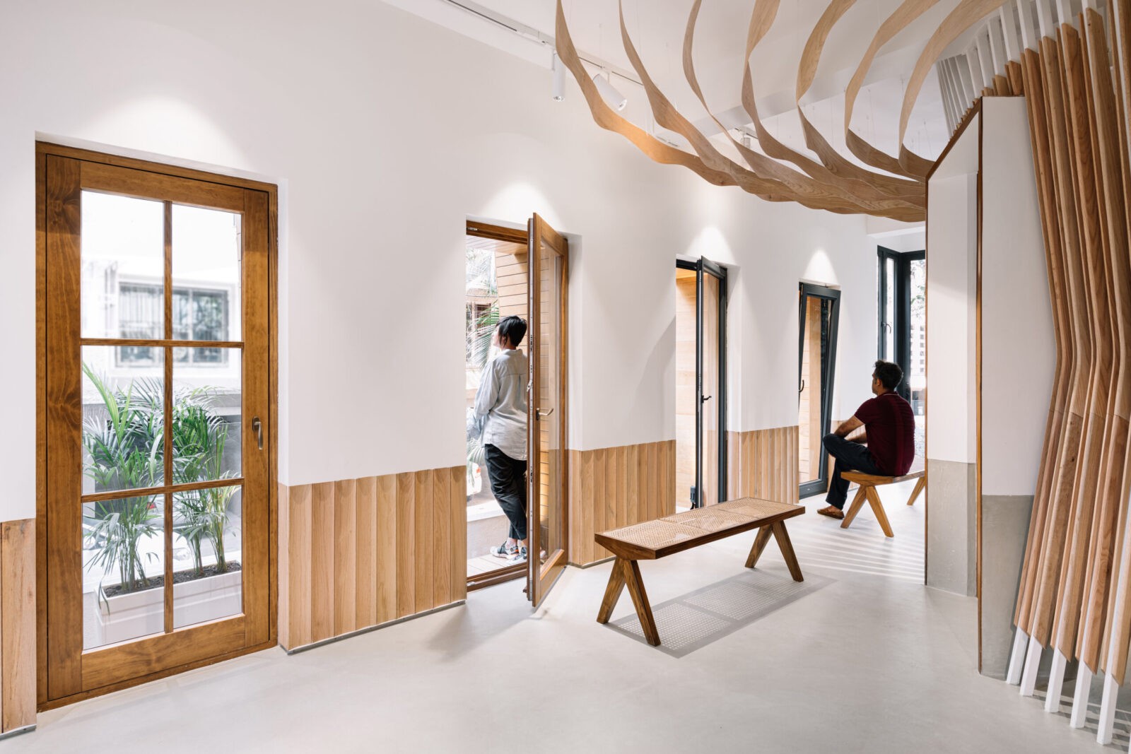
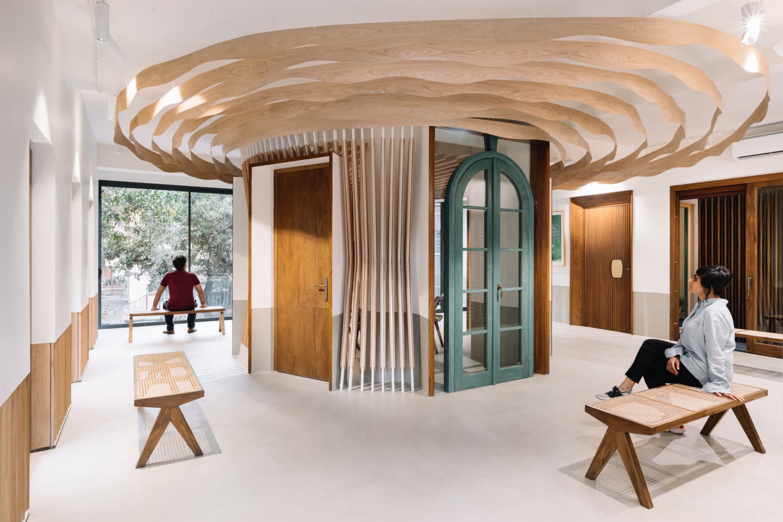
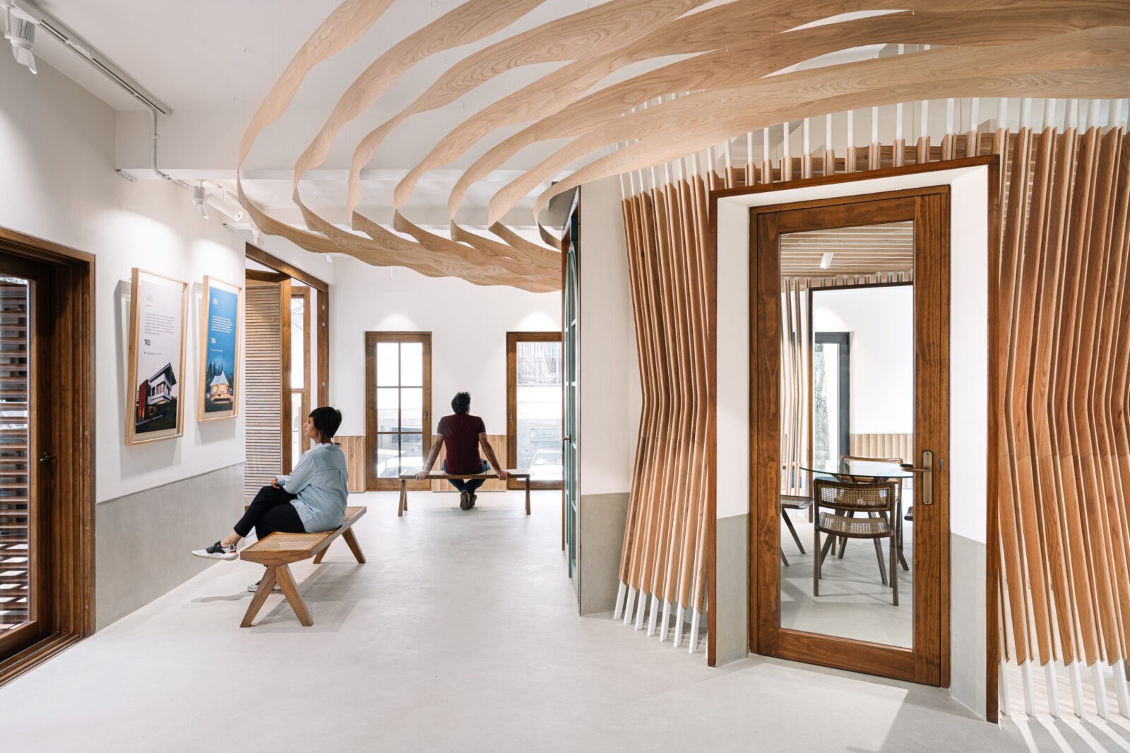
On a conceptual level, our approach was guided by the word “gallery”. These are premiumcustom-builtproducts and are displayed as such – with adequate breathing space around each to appreciate them individually. We were led by the image of an art gallery, placing a bench that allows a viewer to pause and contemplate the product, which is then elevated almost to the status of objet d’art. This is also reinforced by the lighting design by Studio Trace, with adjustable track spotlights highlighting the products and wall washers providing indirect ambient illumination. The flooring continues seamlessly onto the dado providing a neutralgrey backdrop in microconcrete, also a product represented by the client.
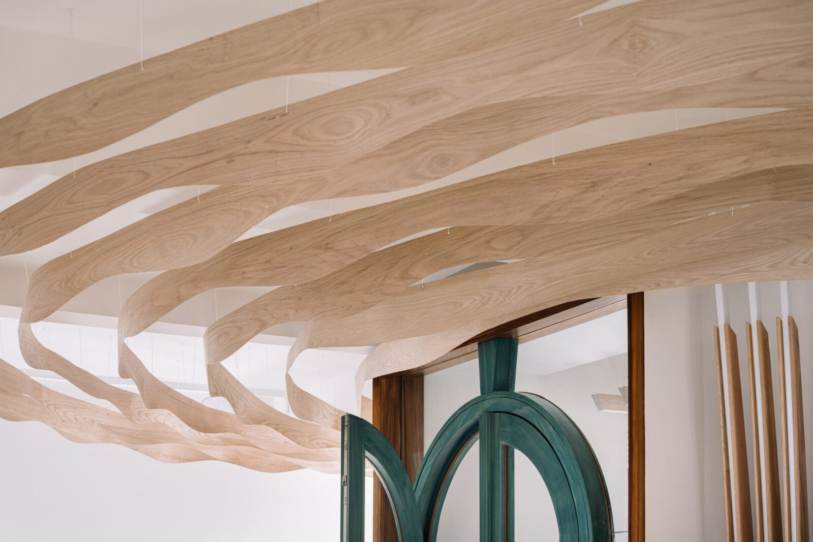
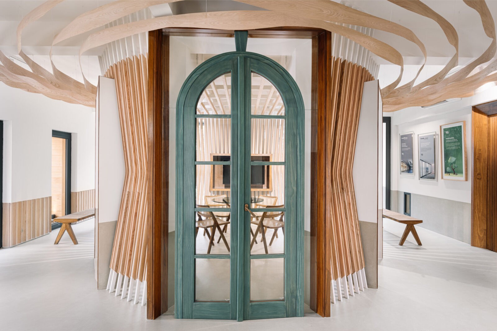
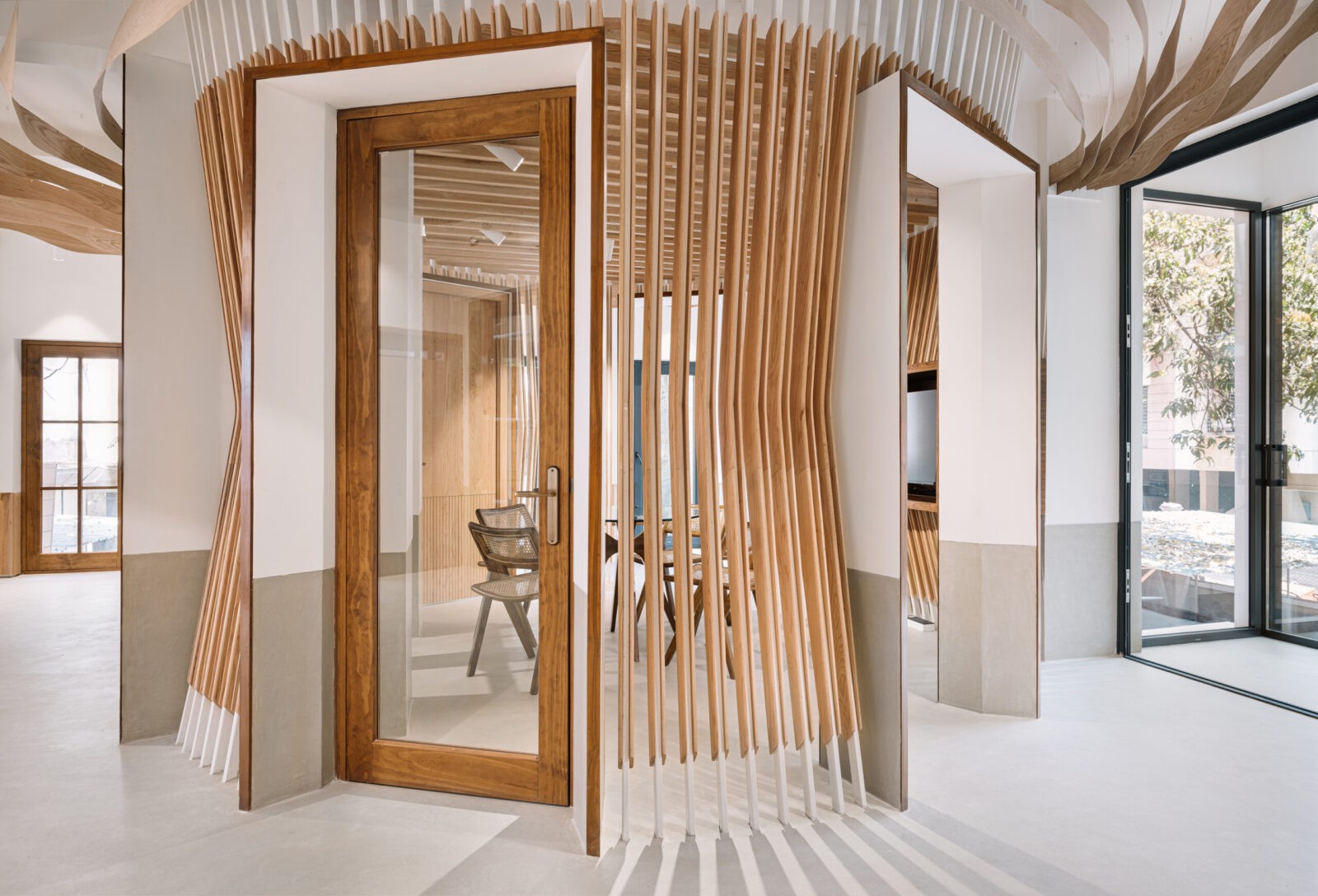
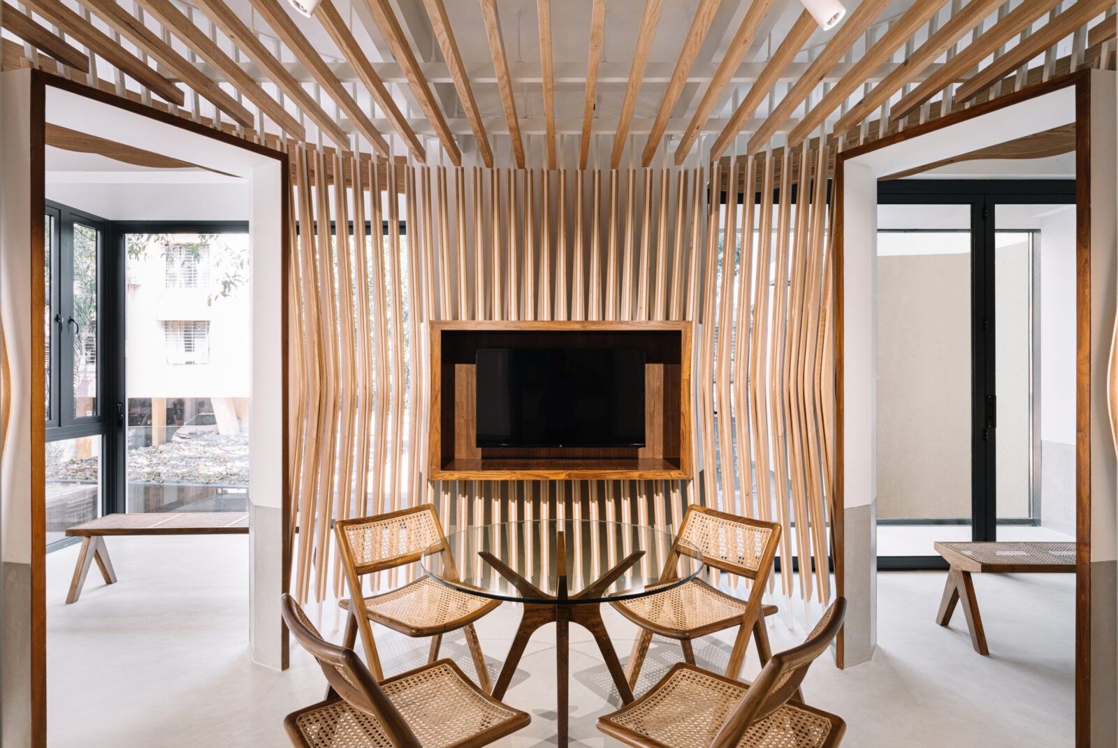
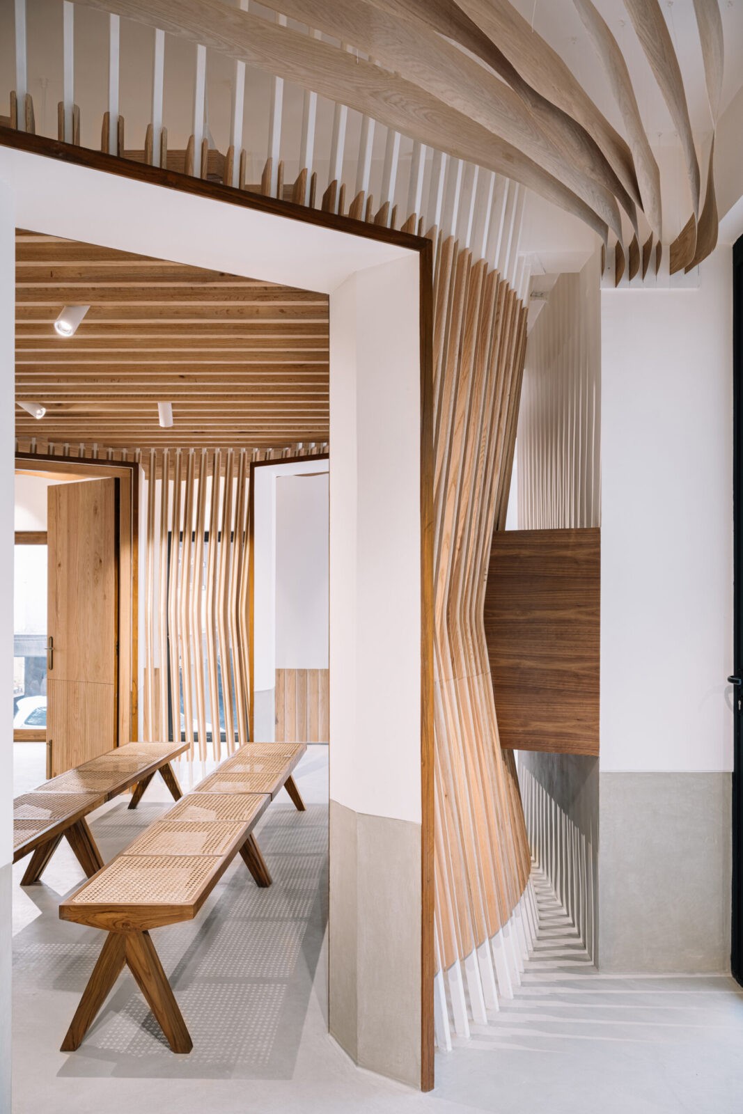
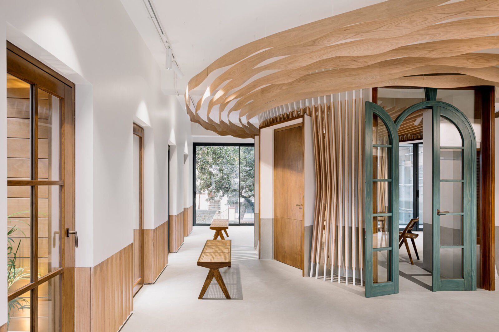
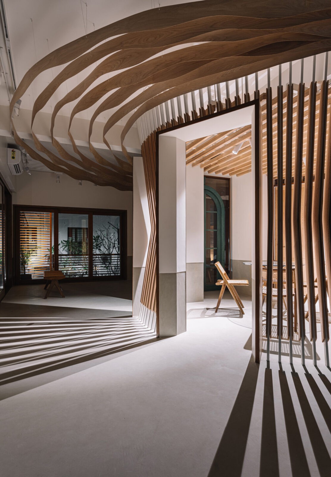
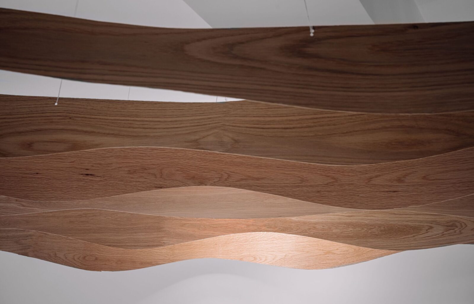
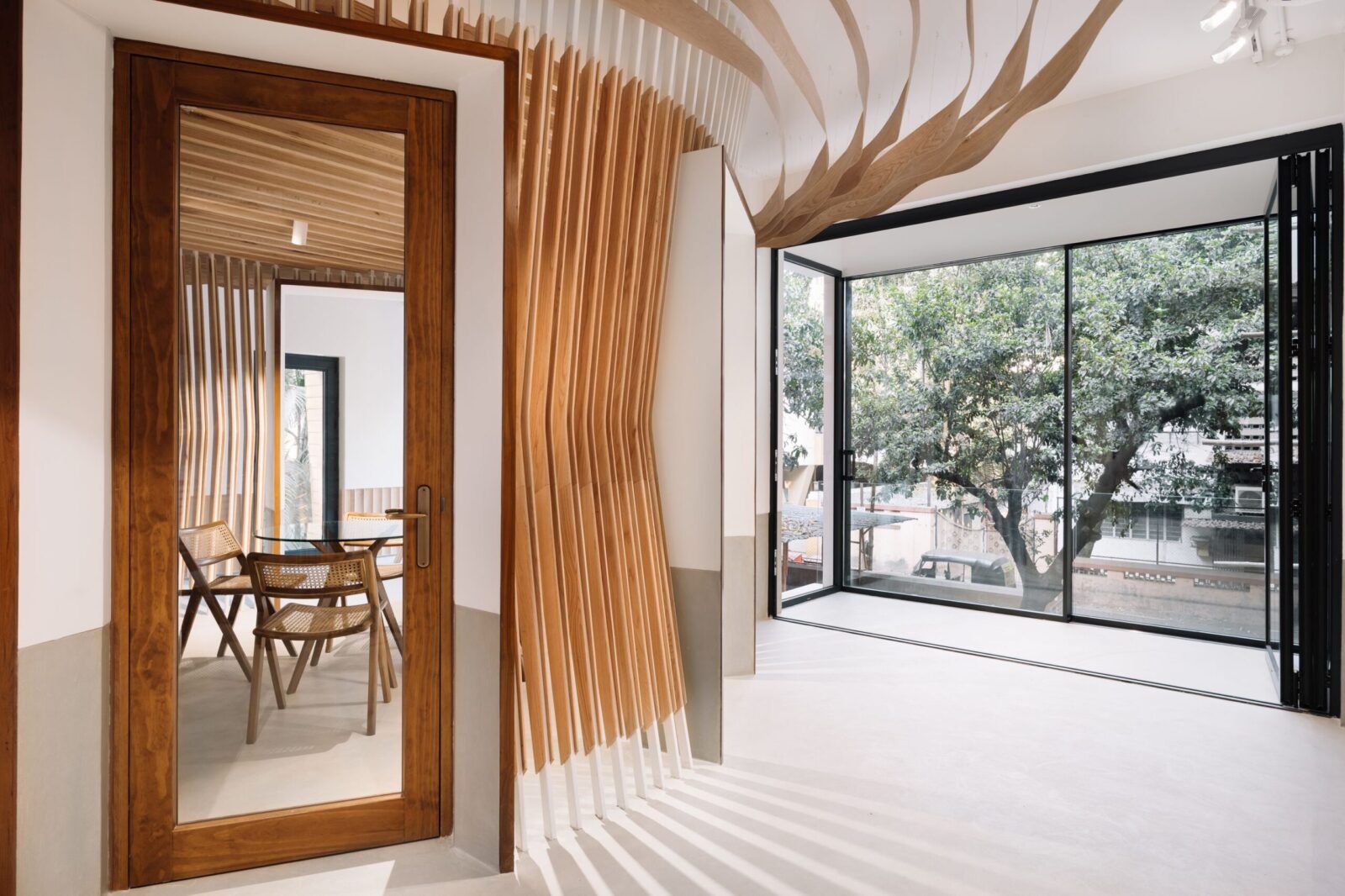
The internal walls were completely dismantled to make the space as open and uncluttered as possible, with a circular zone in the centre circumscribed around the two free-standing columns that remained after the walls were gone. The partition to this circular zone is made up of American Red Oak timber slats supported on slender MS sections. The slats are shaped like boomerangs that hover in mid-flight between the floor and ceiling, touching neither. The lighting scheme takes advantage of this by using wide-angle spotlights nestled between the floating pergola members of the ceiling to flood the inside of the circle with a higher level of illumination, resulting in wonderful slatted shadows radiating outward from withinsuch that one is left with the distinct impression that the entire assembly wasconceived as a giant lampshade. The lampshade-partition is entered through any of five portal frames, which punctuate the slats, into which the solid RitikaaWood doors are neatly slotted. The area within the giant lampshade is designed for flexible use as a discussion area with timber and cane chairs around a coffee table and can double as a seminar area by the deployment of the benches in front of a large screen TV where presentations can be made – either to designers/ clients or to train up to ten team members. The ceiling around the lamp is formed by delicately undulating not-quite-concentric waves of paper-thin oak veneer, reminiscent of the rings seen in the cross section of a tree.
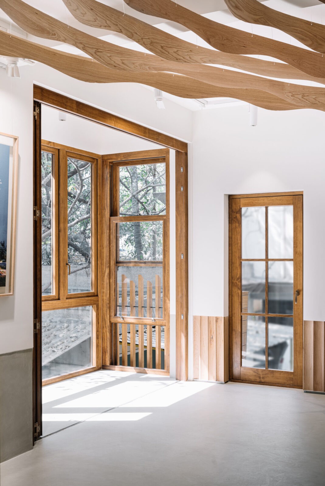
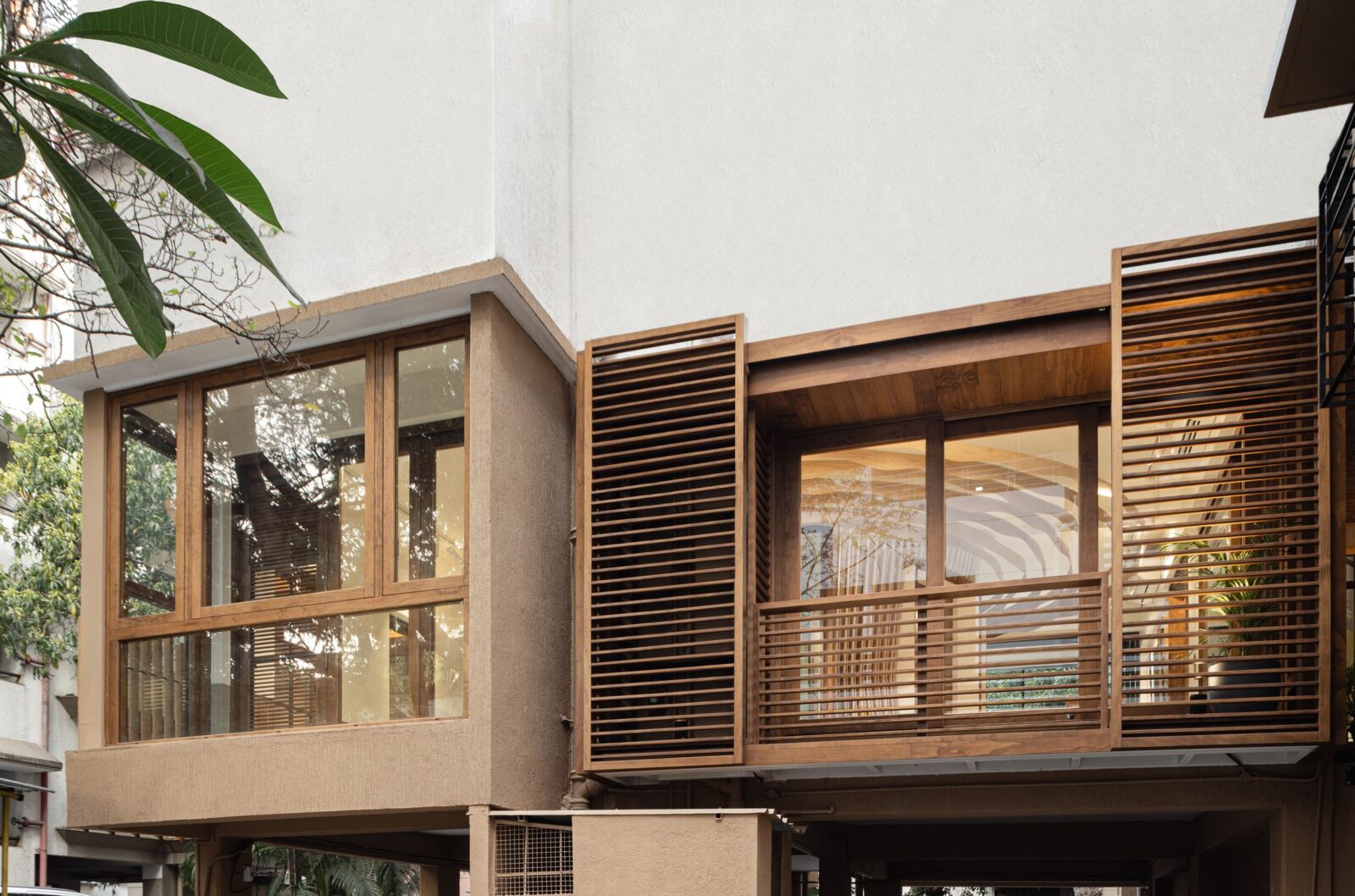
Advantage has also been taken of the balconies that were enclosed by the previous tenant to display products such as sliding-folding/ concertina-style doors at the threshold, with sleeker windows of varying types along the external wall. Using MS framework and timber cladding, a new balcony was added on to the side of the building, with louvered timber handrails and sliding brise-soleils used for solar shading but also to hide AC outdoor units, providing access to them when needed.
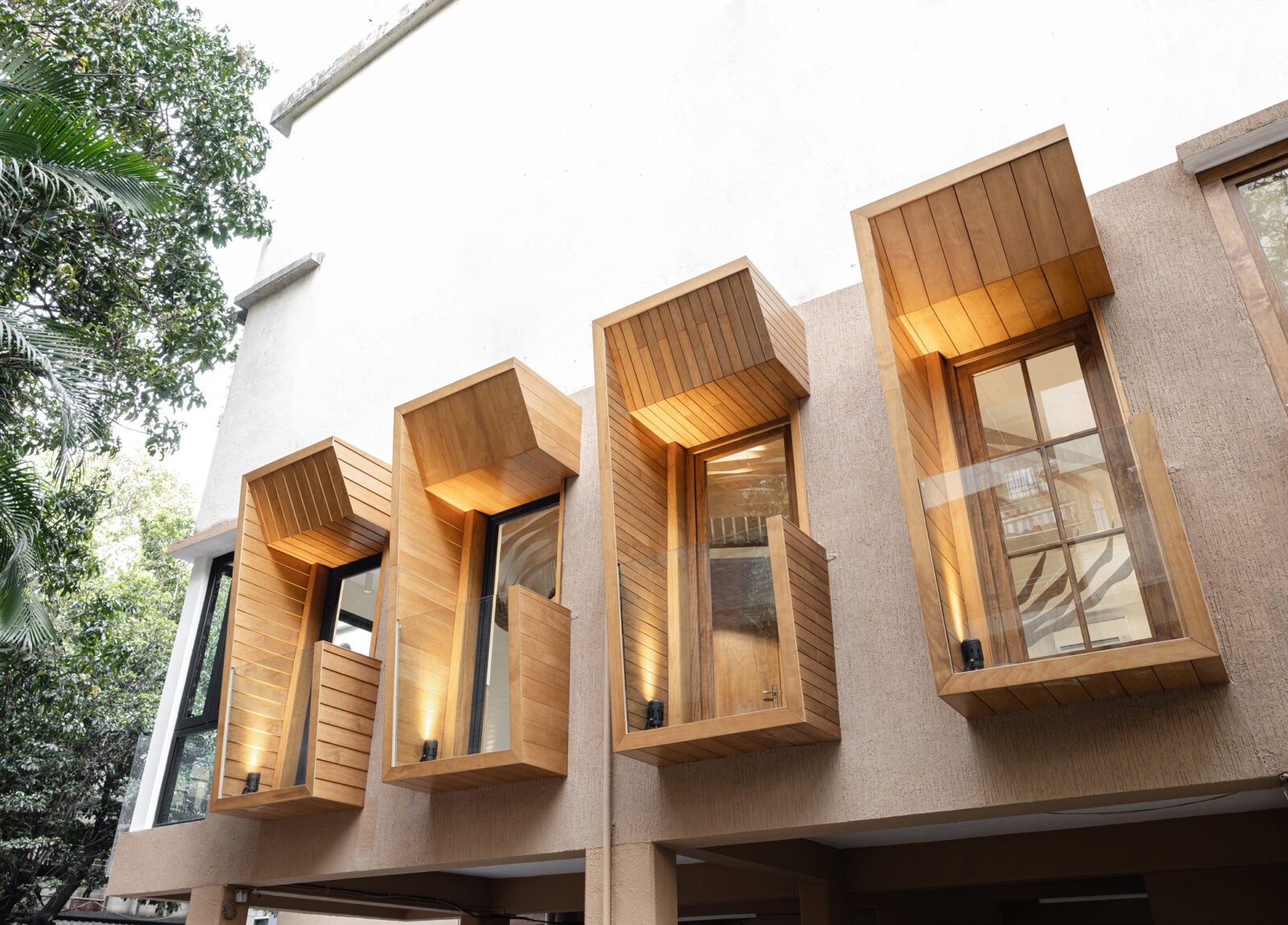
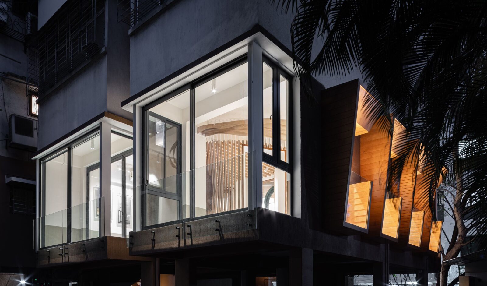
On the wall opposite the entrance we punched two new windows to match in size and spacing the two existing ones, and then extended all four into Juliette balconies that lean outward to form a repetitiverhythm across the façade, each displaying a different technique of timber cladding. On the internal face of this wall, the grey seamless dado is replaced by a wainscoting in fluted oak panels with shadow grooves above and below. As with the Juliettes, the wainscoting is an all-but-lost feature of traditional architecture, and both have been re-visited in a contemporary manner to create patterns of varying density inside and outside.
When viewed from the outside at twilight, the façade of the first floor too glows like a great lamp, mirroring the one within, but more articulated through differing lenses of glass, timber cladding, louvers, fins and handrails.
Design Team: Pravir Sethi, Chintan Zalavadiya
Lighting design: Studio Trace
Photography: the fishy project

