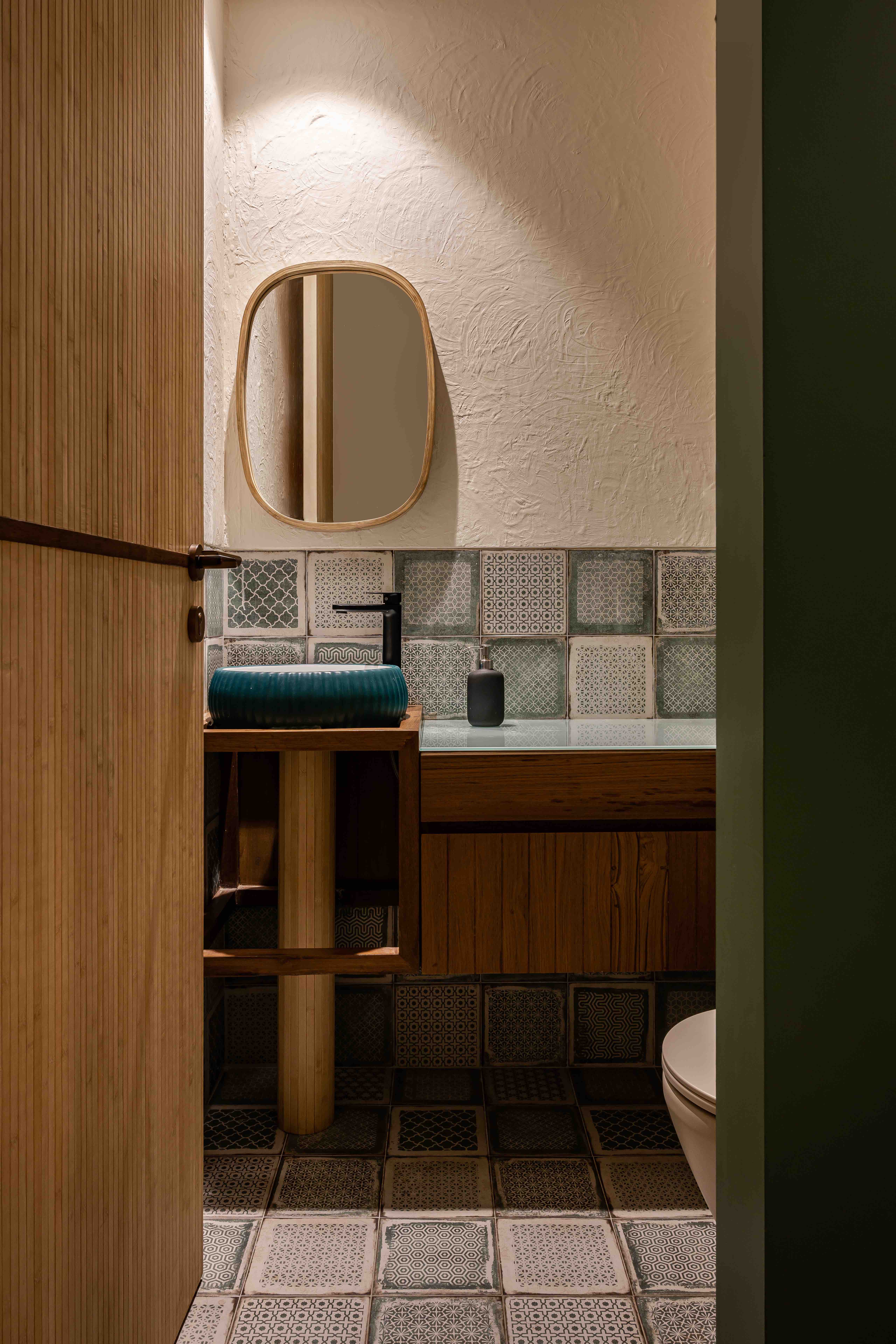
The Green House
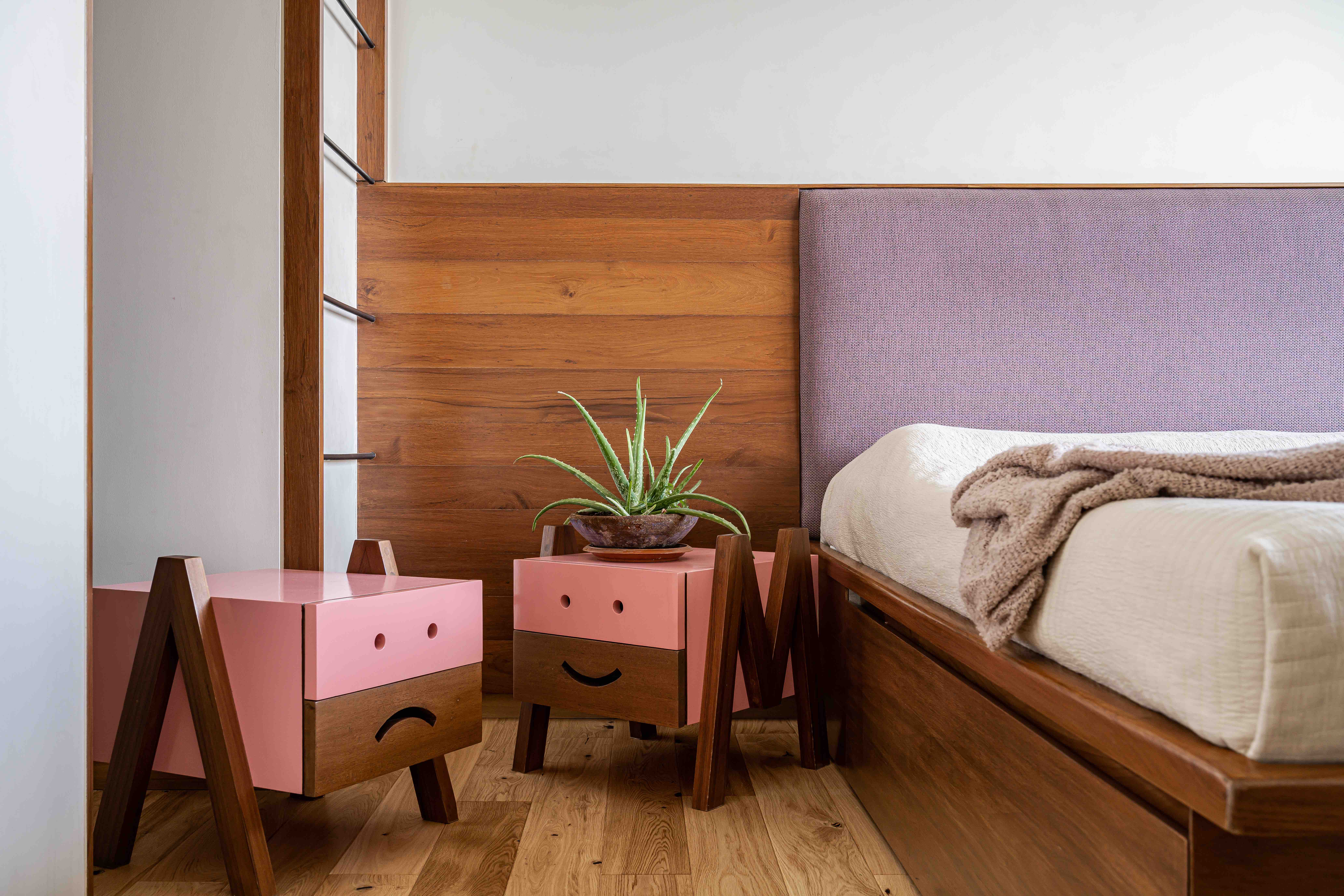
When the young family of four commissioned us to design the interior of their new apartment, it was with a very particular brief in mind. They were happy enough to give a us a free hand at design, but there were two key themes that they wished us to incorporate. One was an image of a hobbit’s house in The Shires – from the movie The Hobbit (part of the Lord of the Rings Series), and the second was simply the word “meadows”. The family loved being outdoors and amongst nature, and wanted to bring this into their home.
Both these initially had us flummoxed, as to how we could bring these themes into the design of an apartment on the 24th floor in a high-rise in Lower Parel. It was an unusual request, to say the least.
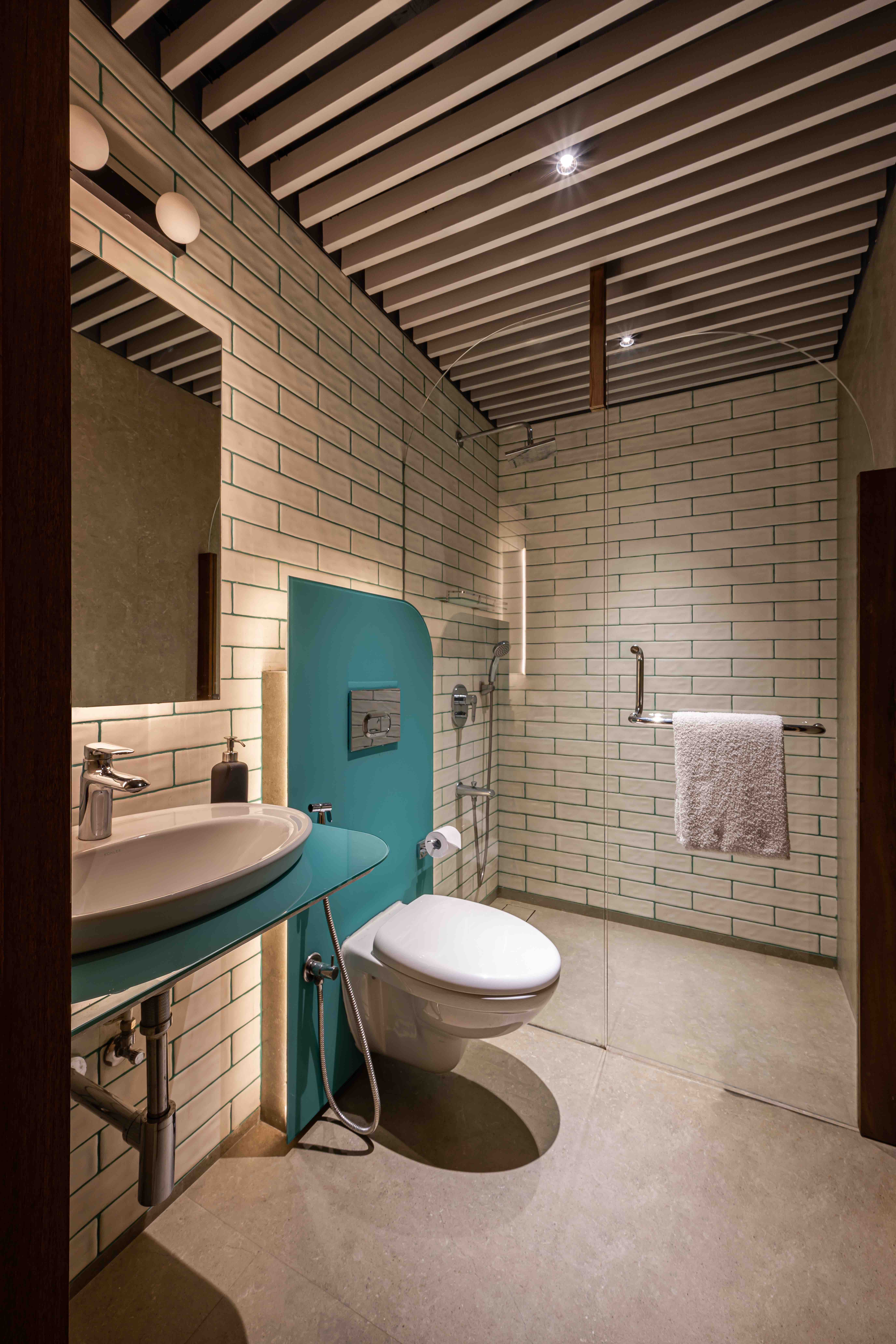
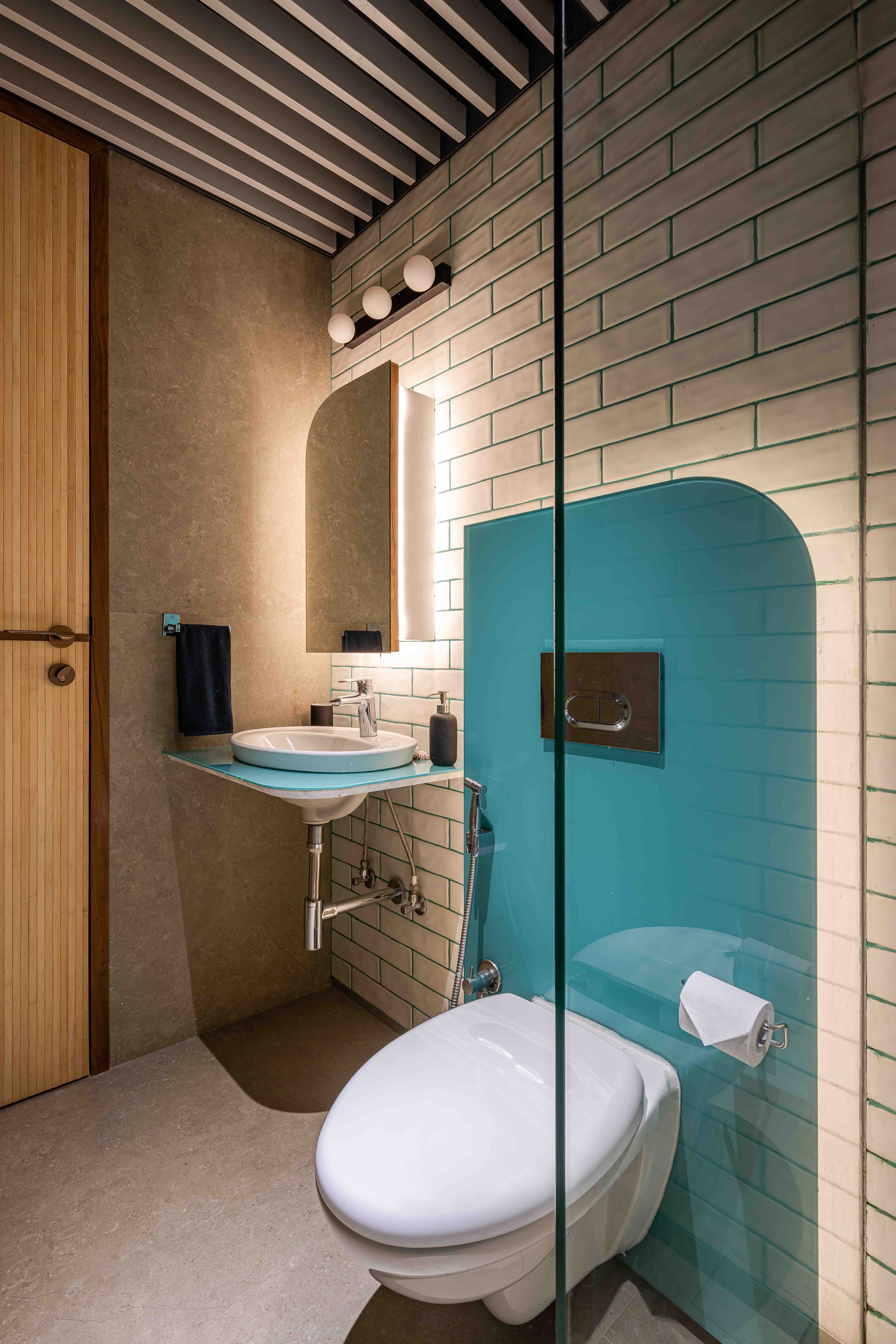
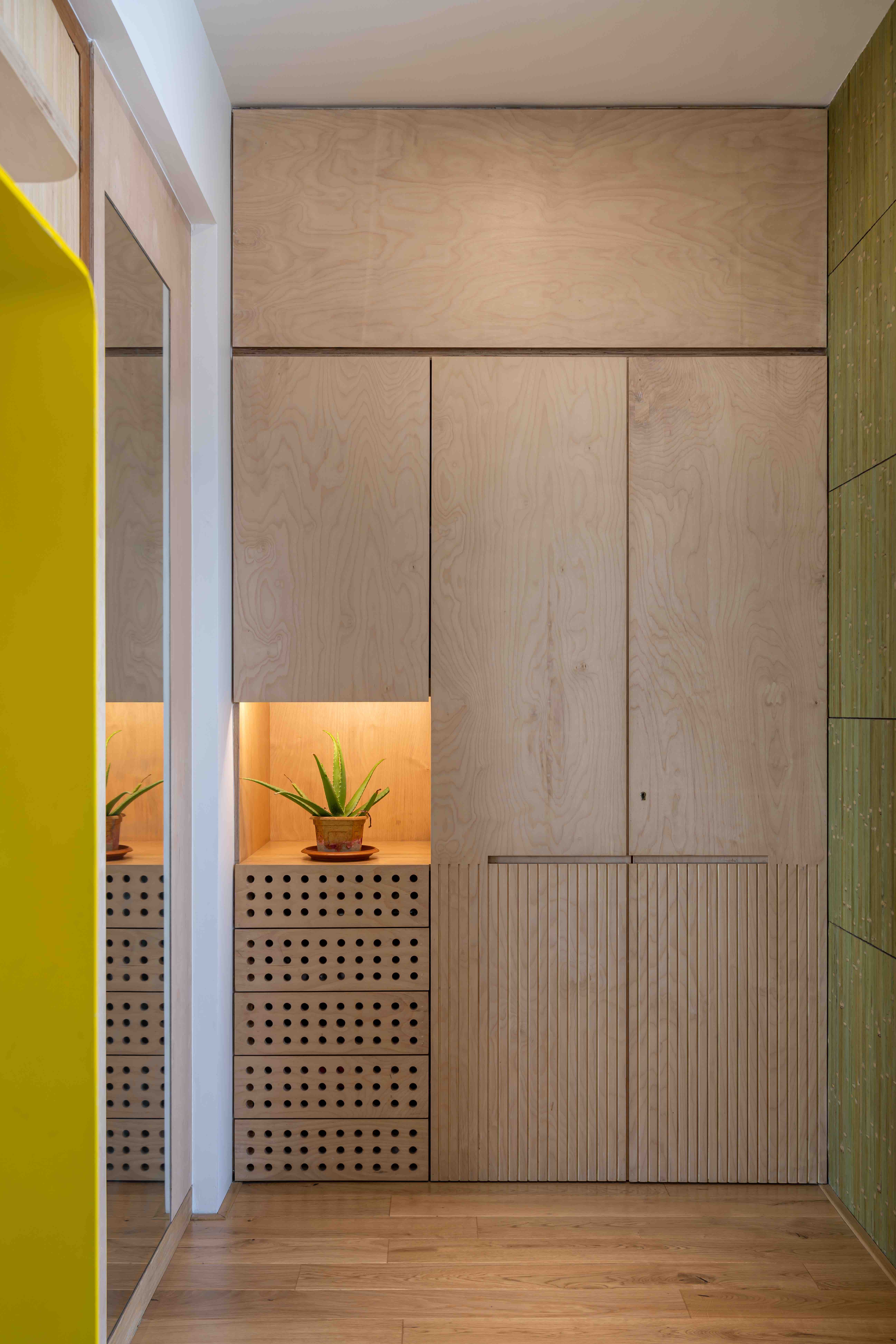
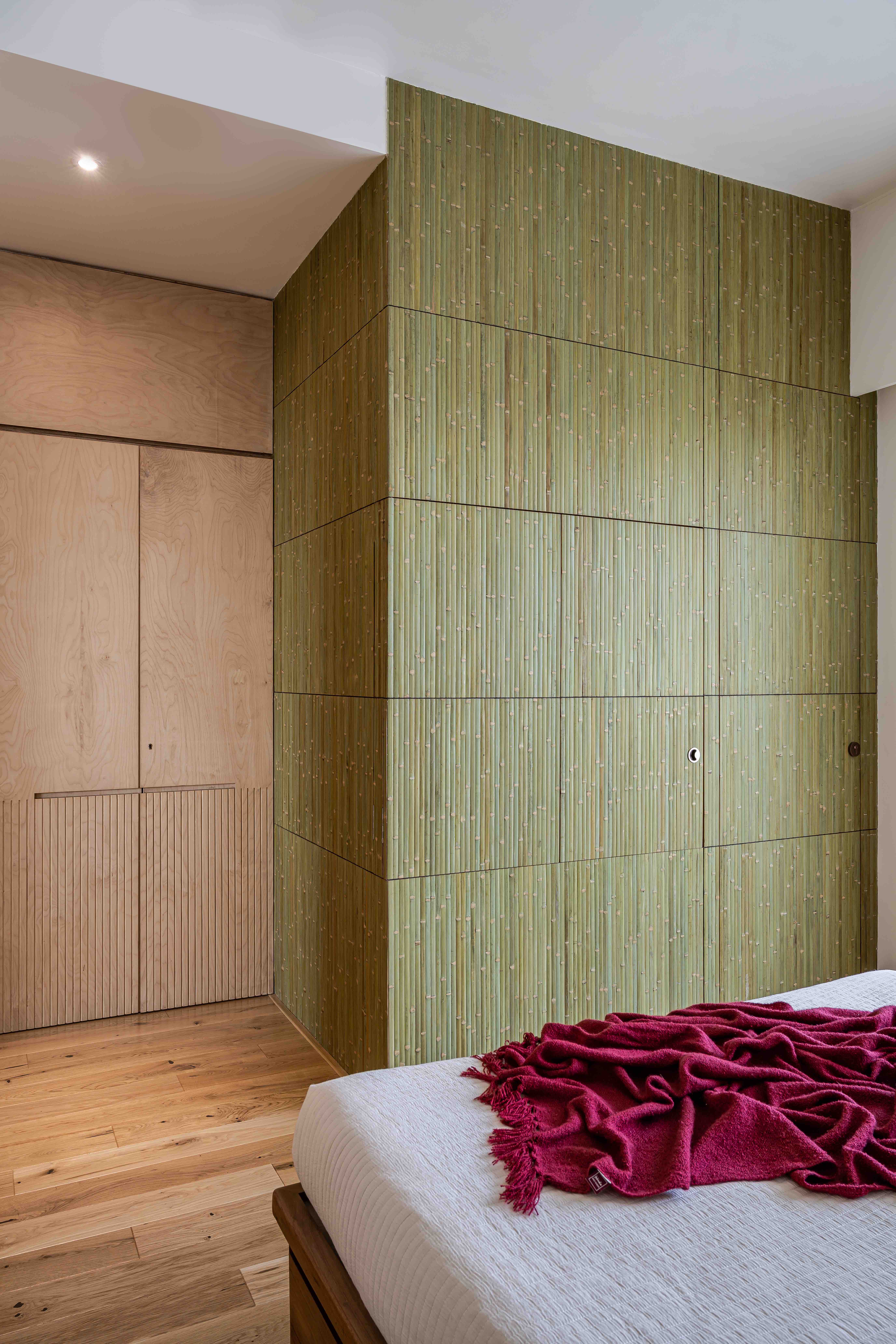
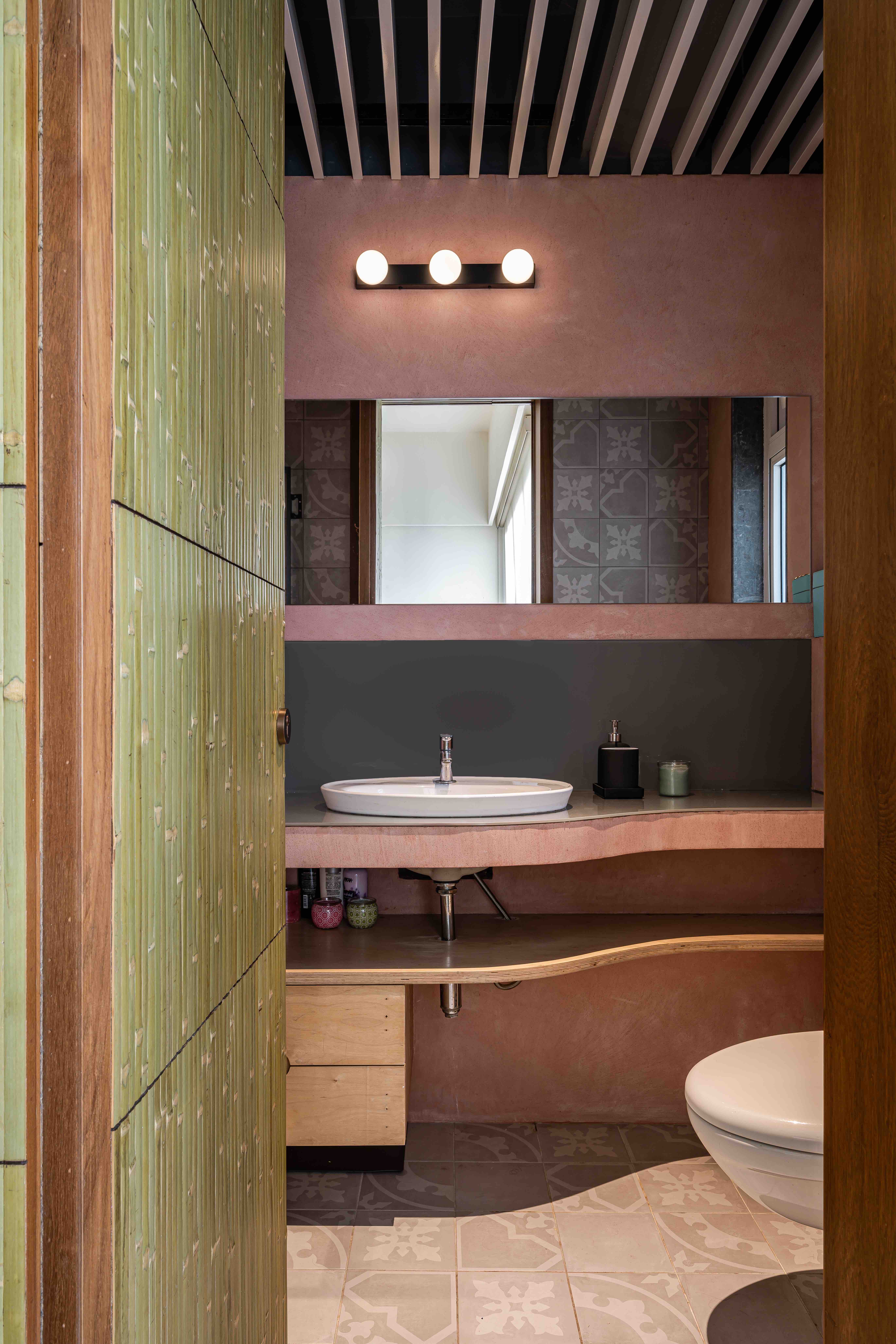
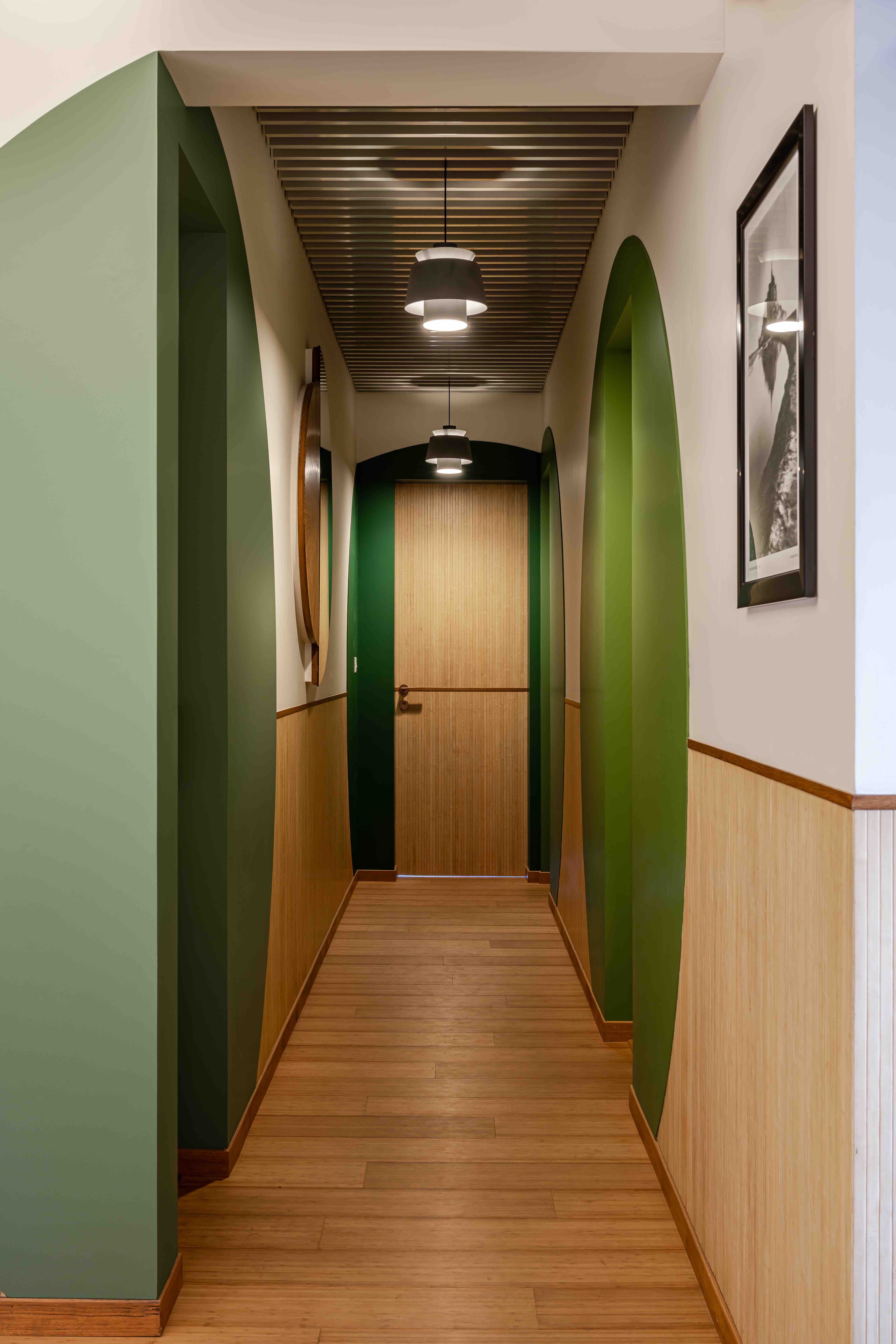
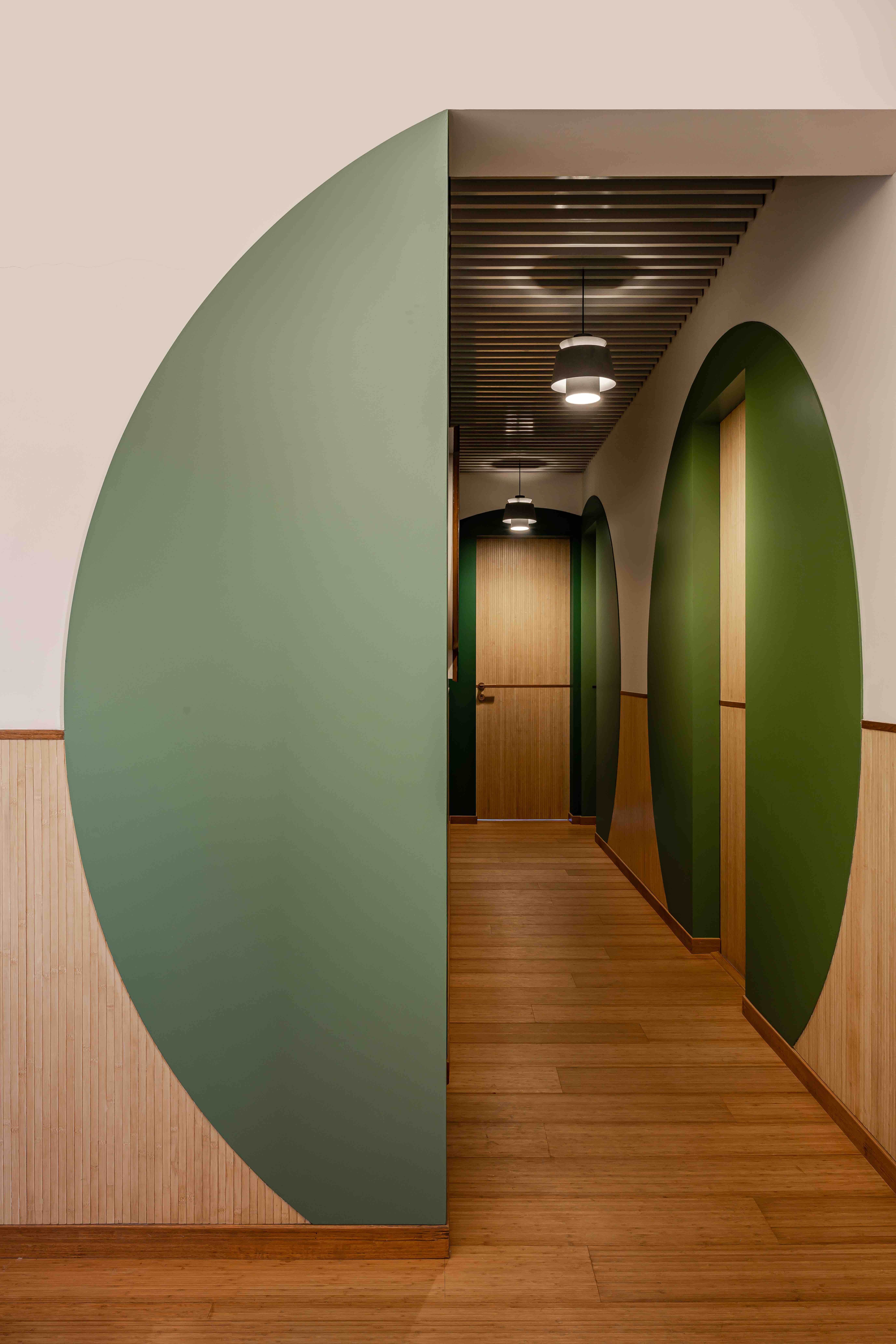
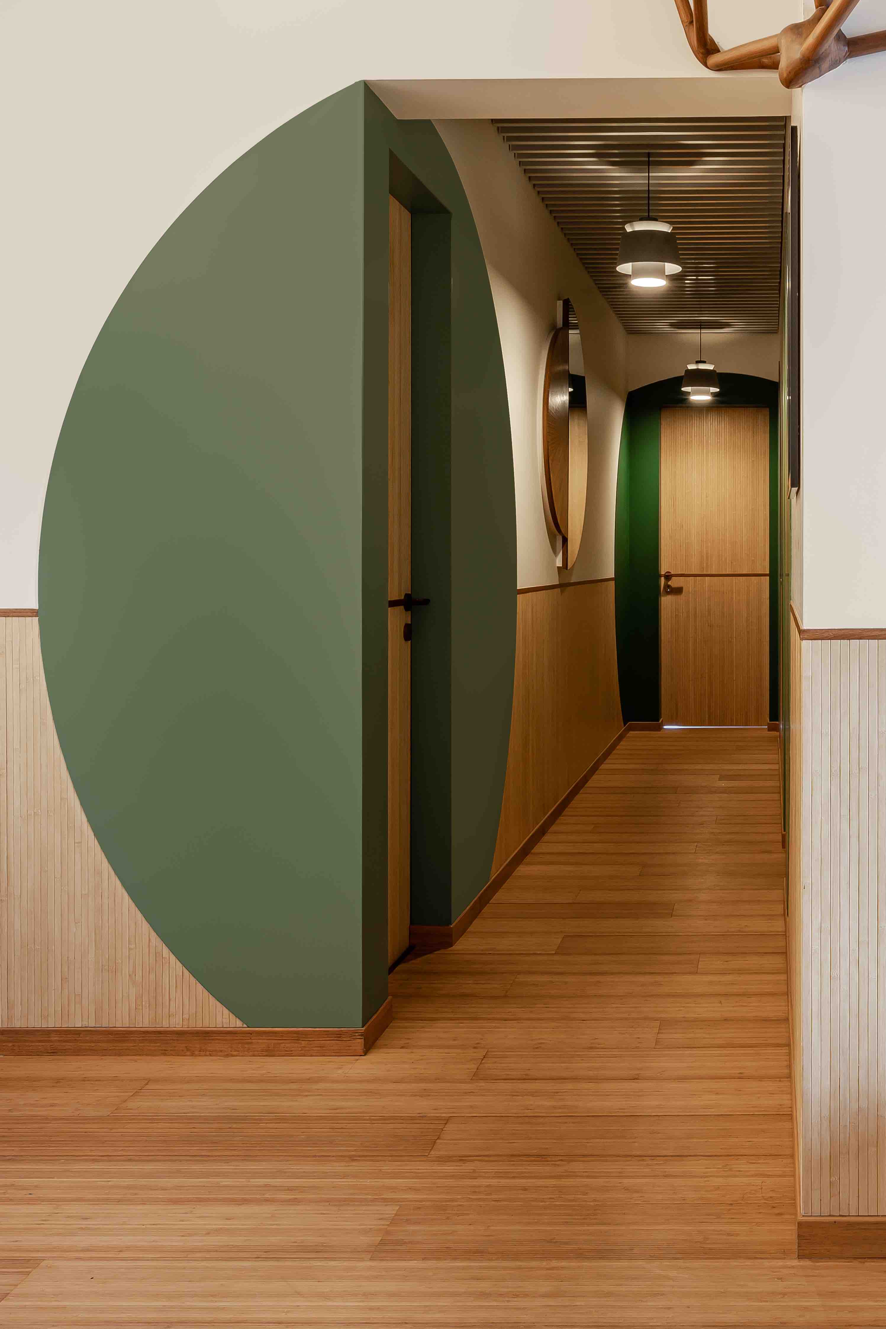
A quick Google search revealed that the houses in the Shires were grotto-like, with large round doors and an abundance of green with ivy covered walls and green roofs. We abstracted this into the design of the passage that led to the bedrooms and powder room, by creating large circular panelling surrounds to each door in varying shades of green, that not only contain the door but bend and wrap around corners. As the passage had only borrowed natural light, this livened up the space. Even the utilitarian functions of the main electrical distribution box and the IT hub, both of which were located in the passage, were covered with semi-circular openable doors in wood and mirror. In this way we created a pared-down representation, creating a distinct visual link to the houses of The Shires.
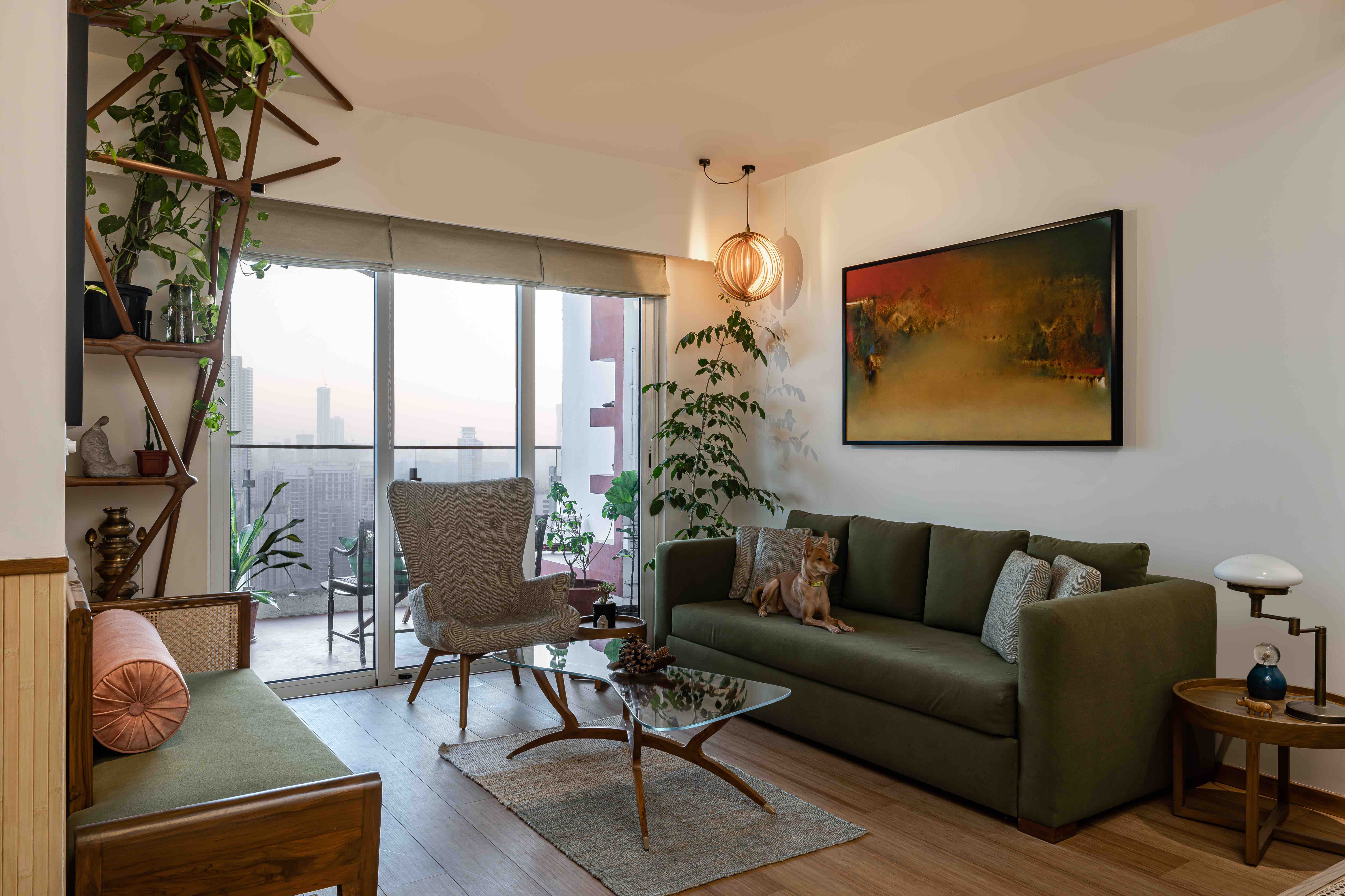
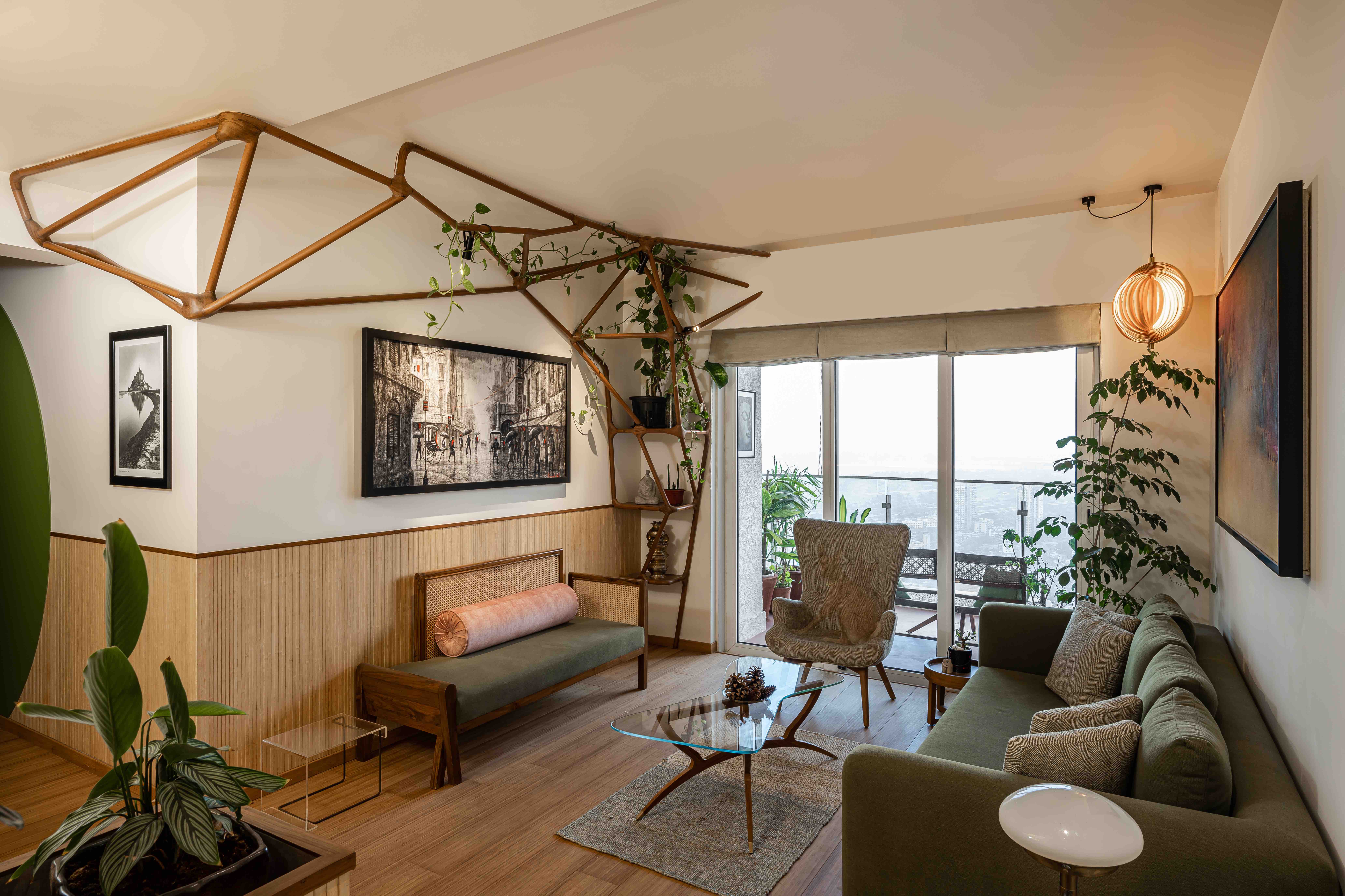
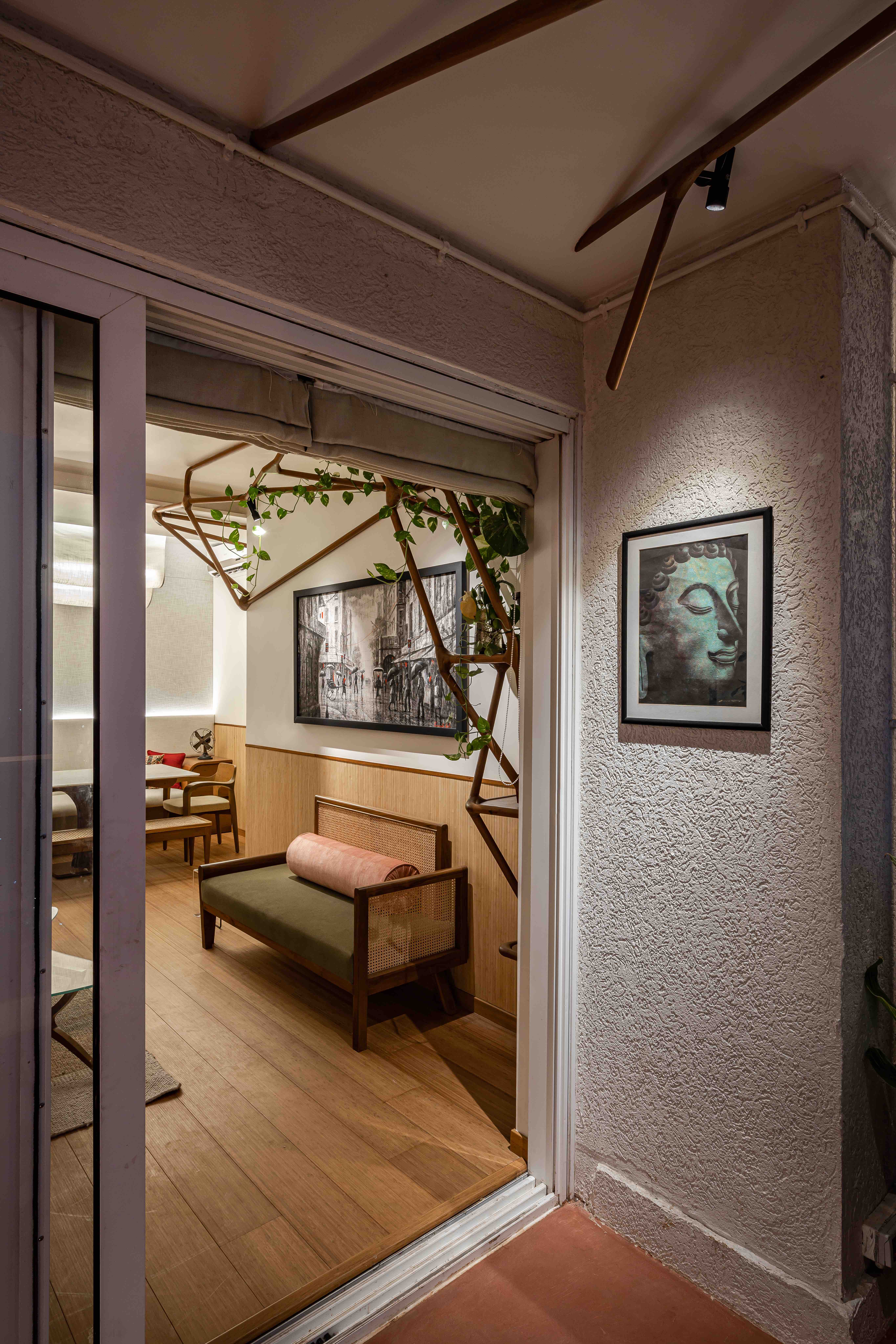
Whilst the shades of green went a little way toward addressing the “meadows” idea, the flat also plays home to a large number of indoor and outdoor plants, made possible due to generous balconies that front each room. On the wall opposite the main seating in the living room, together with a client we eschewed the idea of a TV (each bedroom having its own one) and created a sculptural piece of furniture in hand carved teak wood that starts from the floor, housing shelves and then branching out tree-like, traveling along the living room ceiling and seemingly through the wall out into the balcony. We encouraged the client to grow climbing creepers along this, so that it changes as time goes by, showing less wood and more vegetation. This was designed and modeled using 3d software, and tested virtually in the space before being built using augmented reality to understand the scale. The tree also houses lights, conceived by the lighting designer Tripti Sahni of Studio Trace to hang almost fruit-like within the branches and vegetation to discretely cross-focus on artworks on the wall below and opposite.
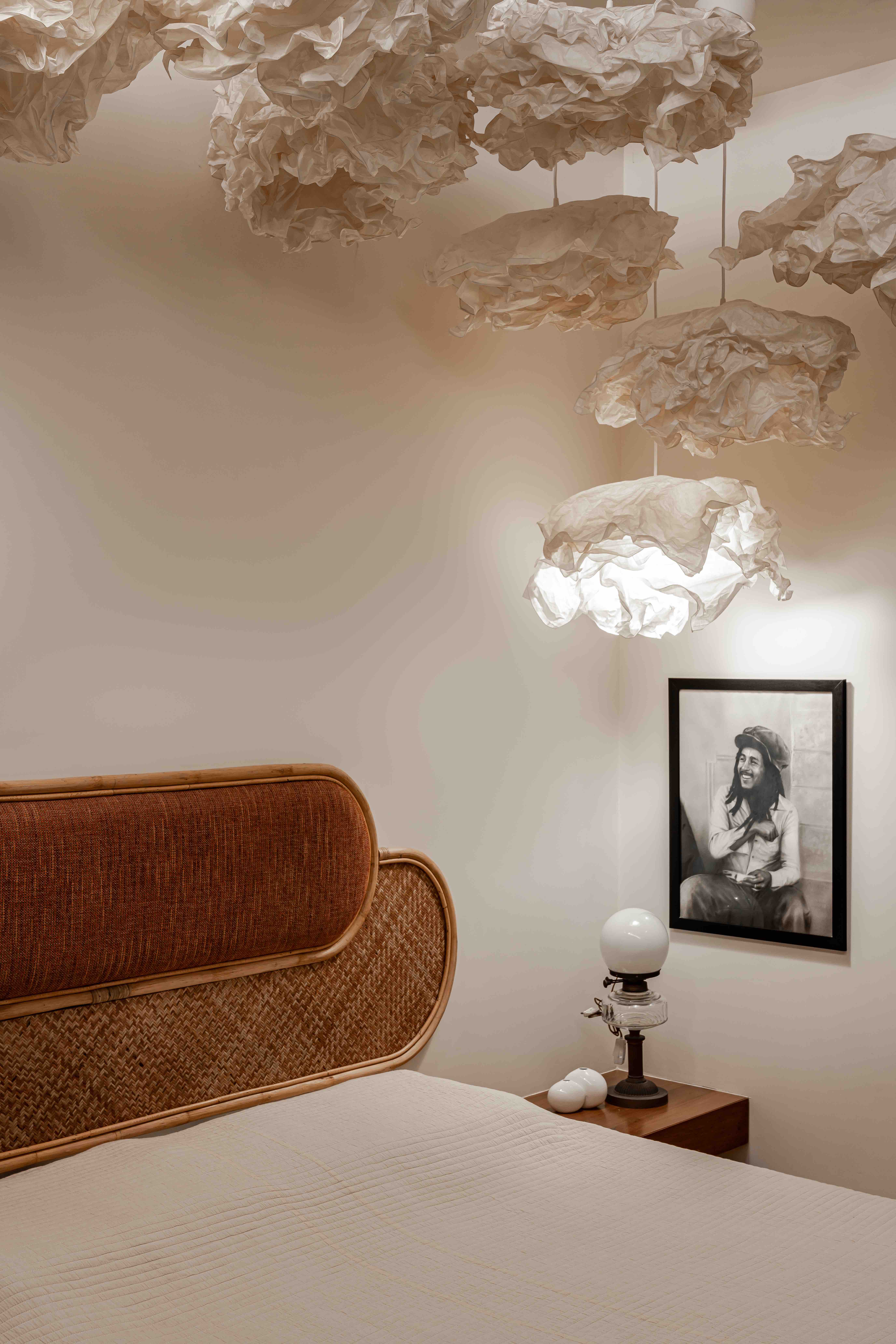
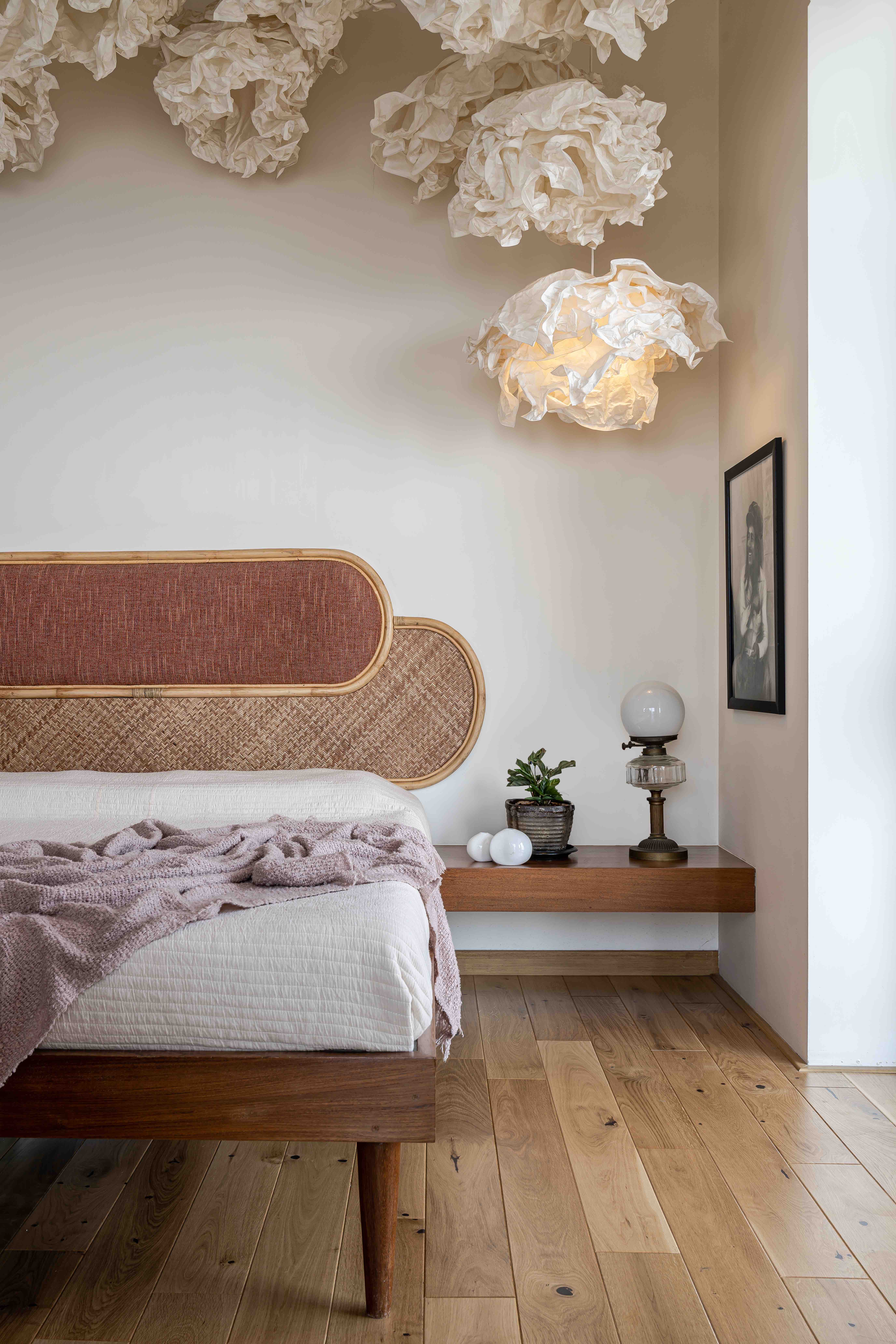
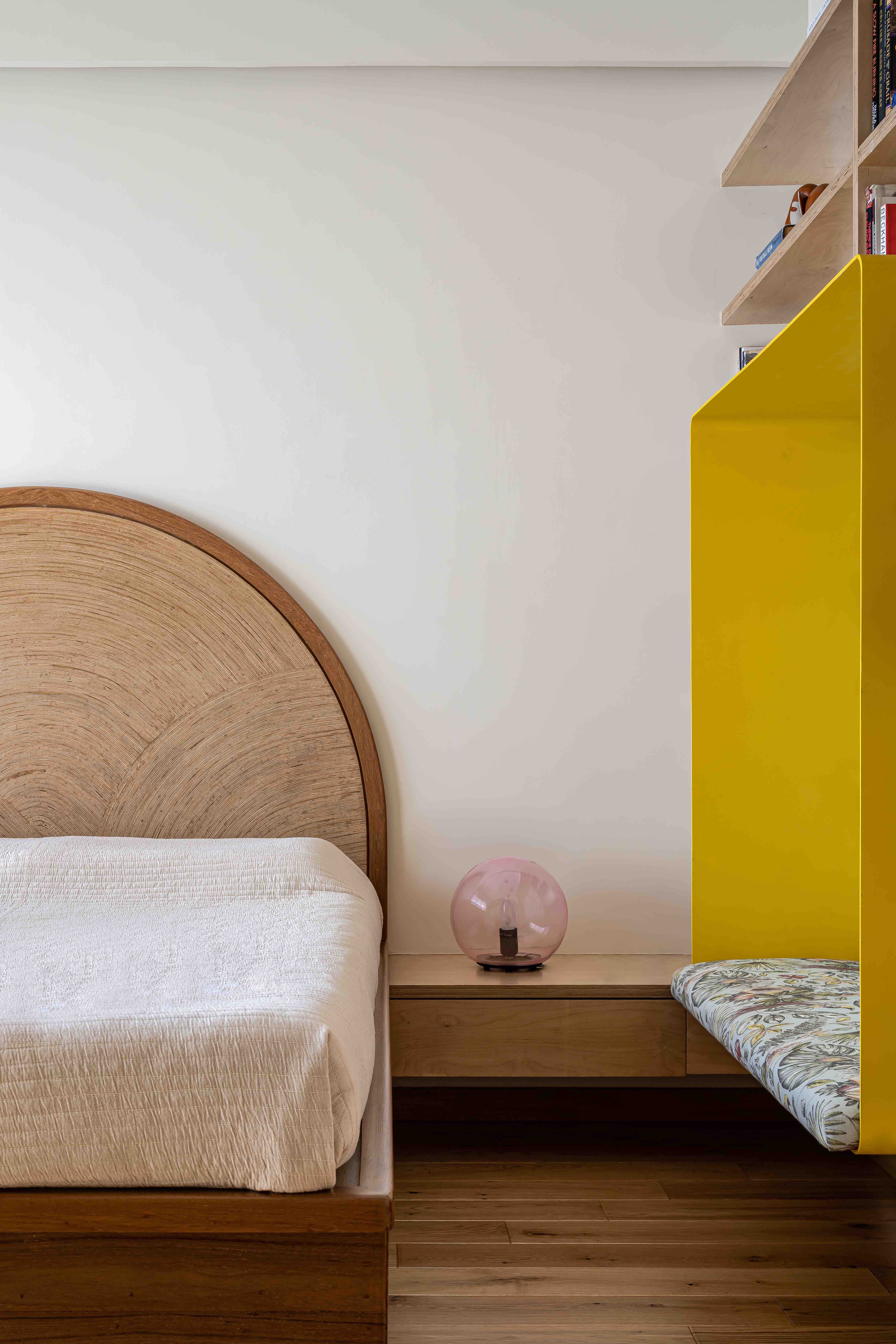
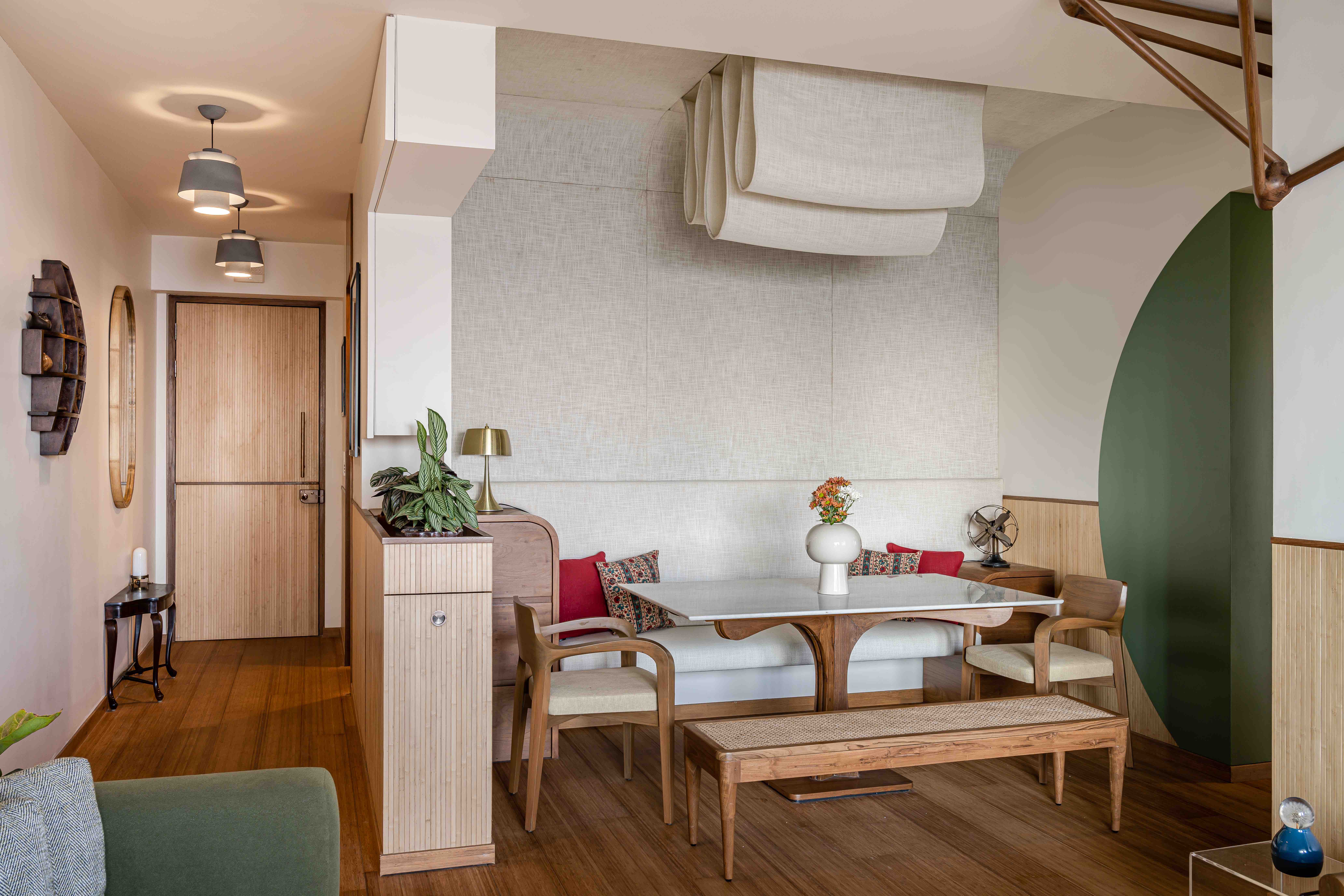
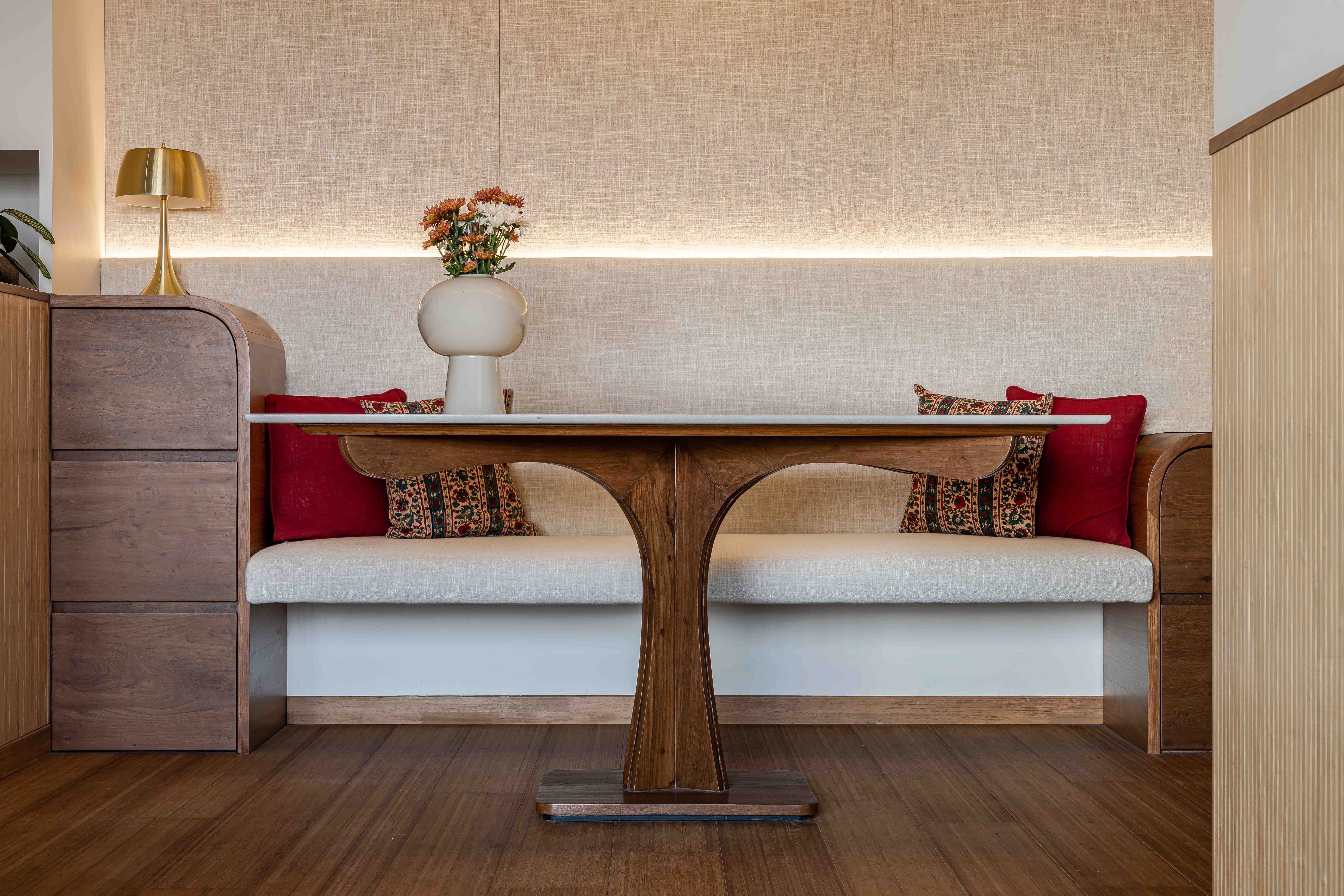
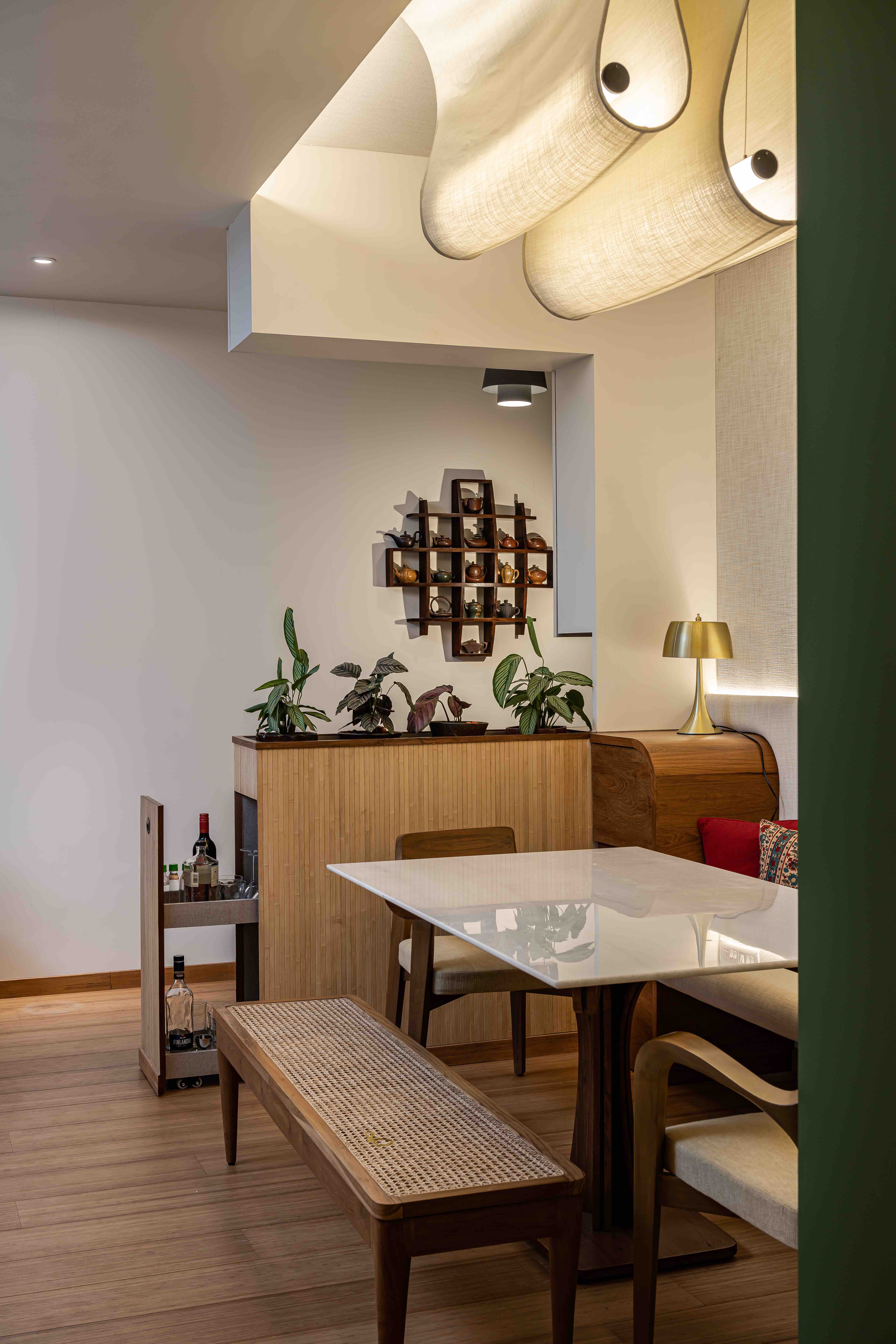
Other features in keeping with the brief for this home include trying to bring in a sense of the sky. In the master bedroom Studio Trace conceived of an installation of sixteen suspended lamps made of crumpled paper, scattered to resemble a cloud formation drifting across the room, especially when one is lying on the bed. (This one took some convincing, but they love it now!) In the dining area this happens via a linen fabric, which upholsters a wall bench, then climbs over the wall and the ceiling before swooping down in soft backlit folds to form a lamp over the dining table.
Design Team: Dhwani Kamdar, Pravir Sethi
Lighting Design: Studio Trace
