worli apartment
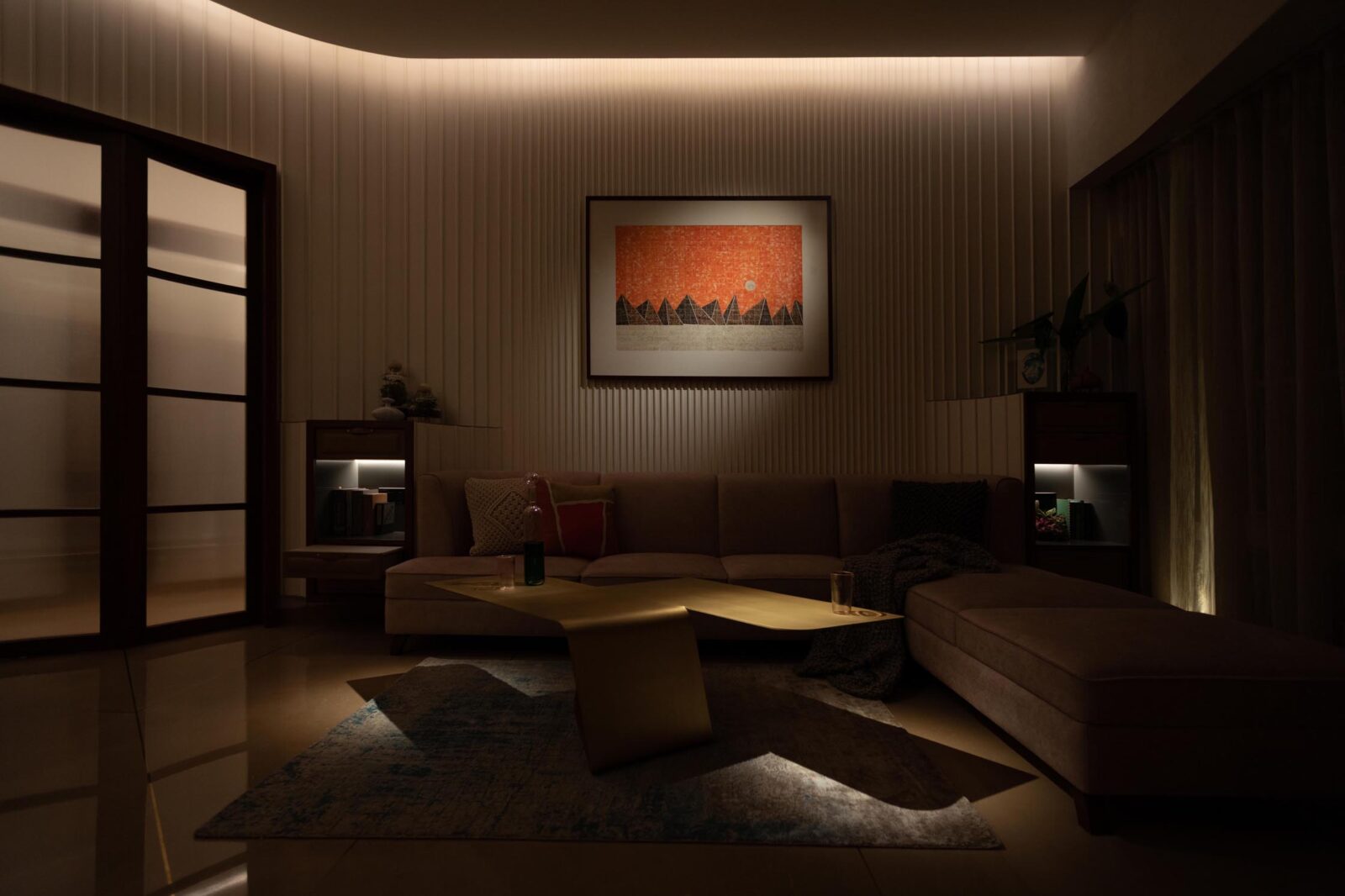
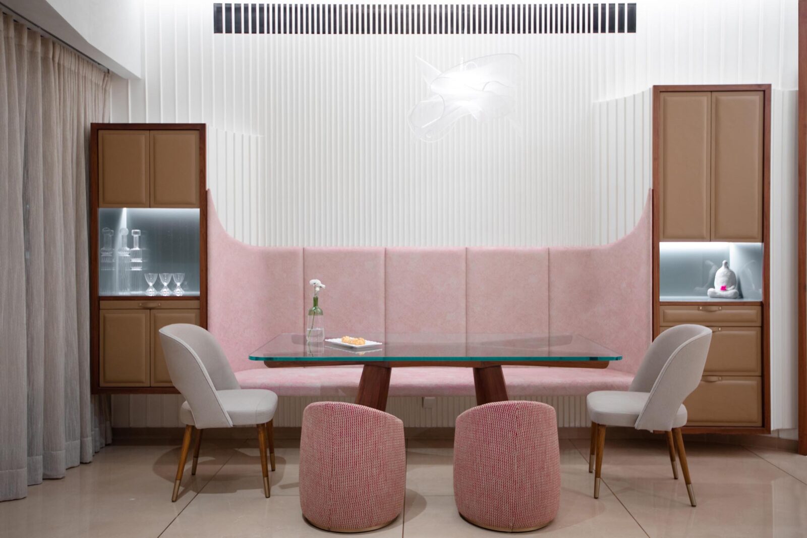
Working on an interior refurbishment in a new residential building of a certain kind in Mumbai comes with its joys and challenges. The rooms and bathrooms are well appointed, but with sizes rarely as generous as those found in older apartments. The structure – comprised of long shear walls and flat slabs – does do away with unwanted beam and column offsets, but with its rigidity precludes any significant changes to the layout. Full-height curtain wall glazing especially at higher floors allows in levels of natural light and views over the city which were both unachievable in a traditional masonry wall construction, but restricts ventilation to small openings and leaves one craving open space.
It was taking these challenges as starting points for opportunities that informed our problem-solving approach to not just the functional, but also the emotive aspects of our design solution for this family. Once the challenge at hand was resolved, detailing and the use of materials, textures and lighting followed naturally.
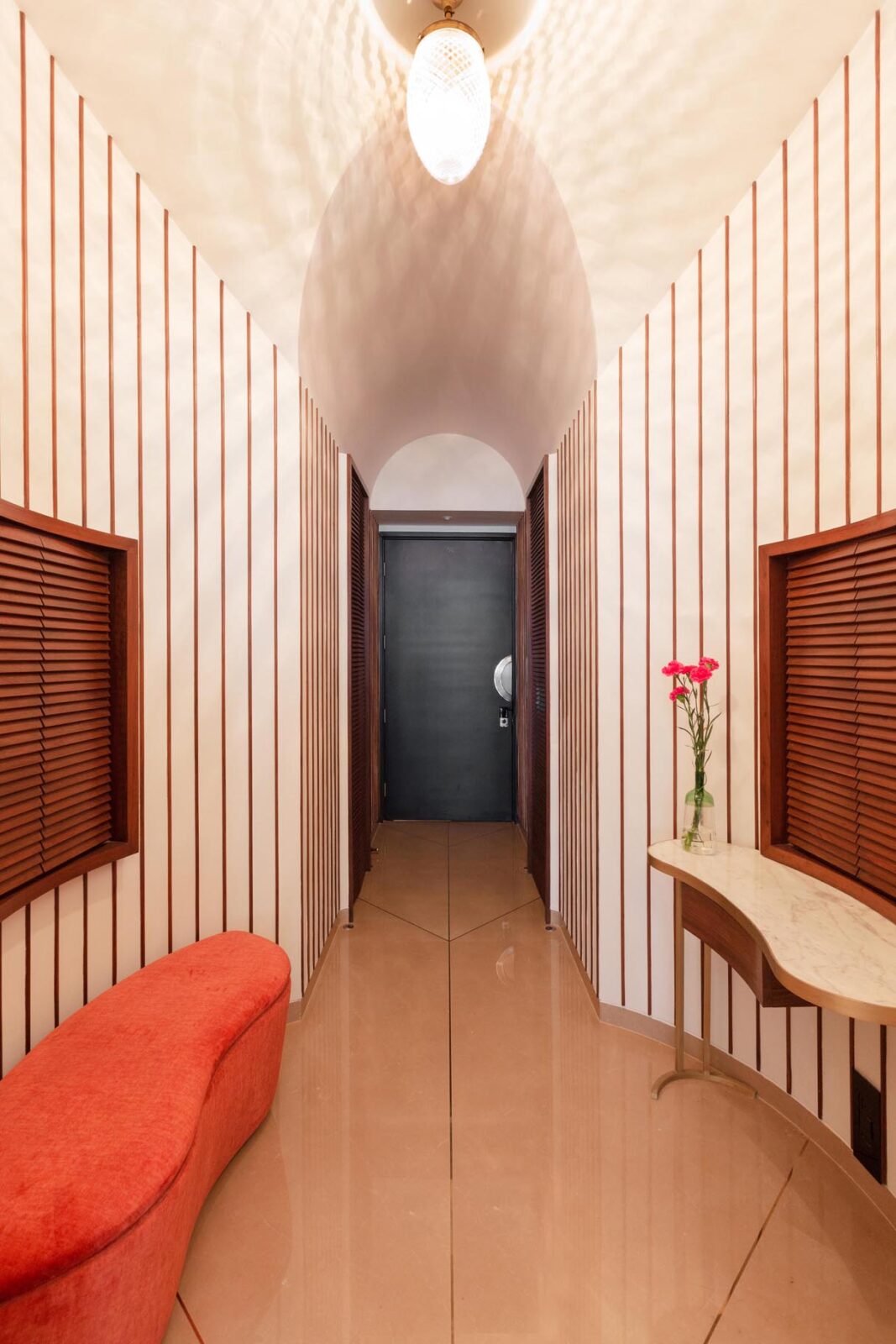
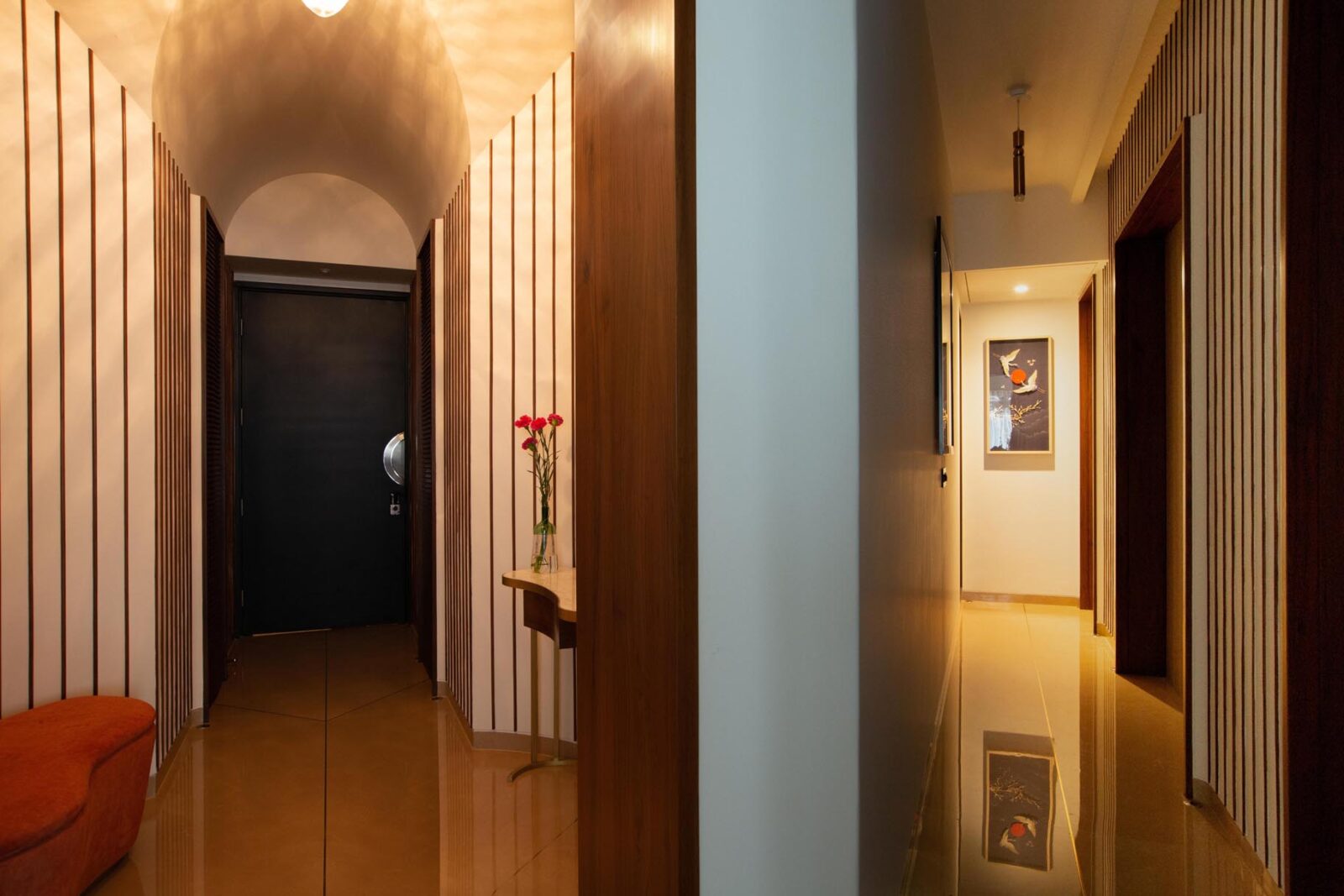
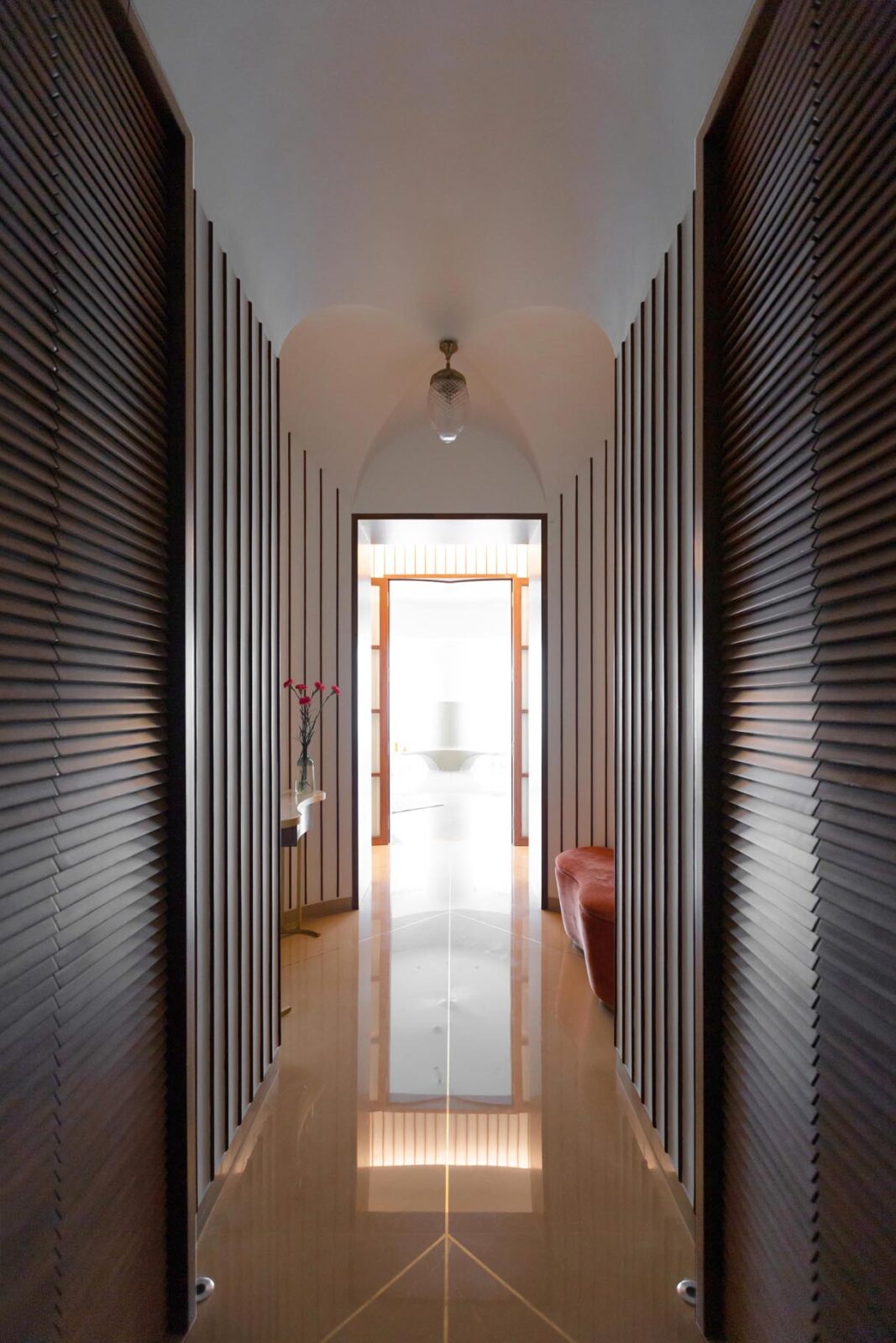
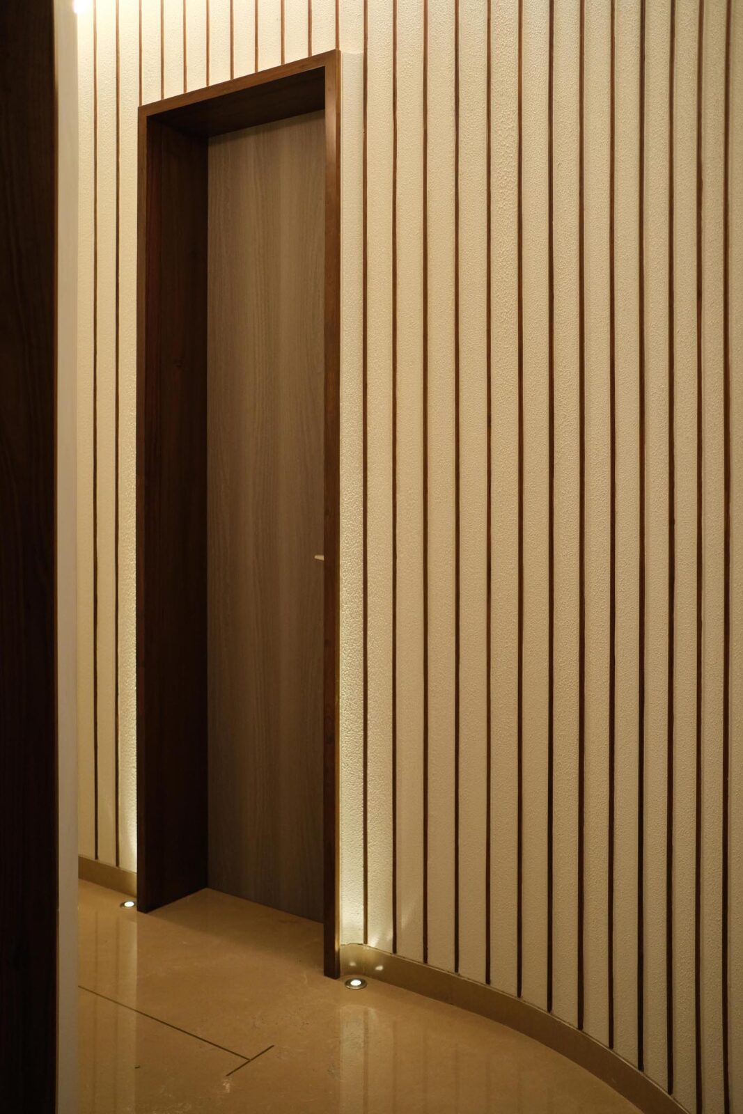
Right from the entrance we were presented with a layout that not only included unavoidable long passages but was also unusual in terms of its orientation along a diagonal (which the family was not too keen on), and inflexible in that it was bound by structural walls. Rounding out the corners of the diagonal square with curved paneling created a softer landing, behind which we carved out storage space and a mandir. Thin vertical timber strips at equal spacing provide relief on the long blank walls of the entrance passage up to the lobby. Two arched ceilings intersect at right angles here to provide an almost gothic-style vault overhead, onto the double curved surfaces of which are stretched curious geometric shadow patterns from a cut-glass chandelier specified by Studio Trace. All doors leading off from the passage are encapsulated within gently curved architraves. In a nod to the ceremonial welcoming diyas, in-ground recessed lamps light up these entrances.
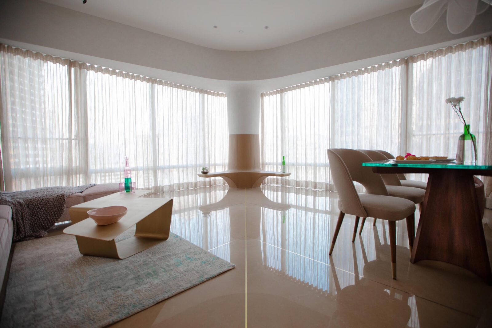
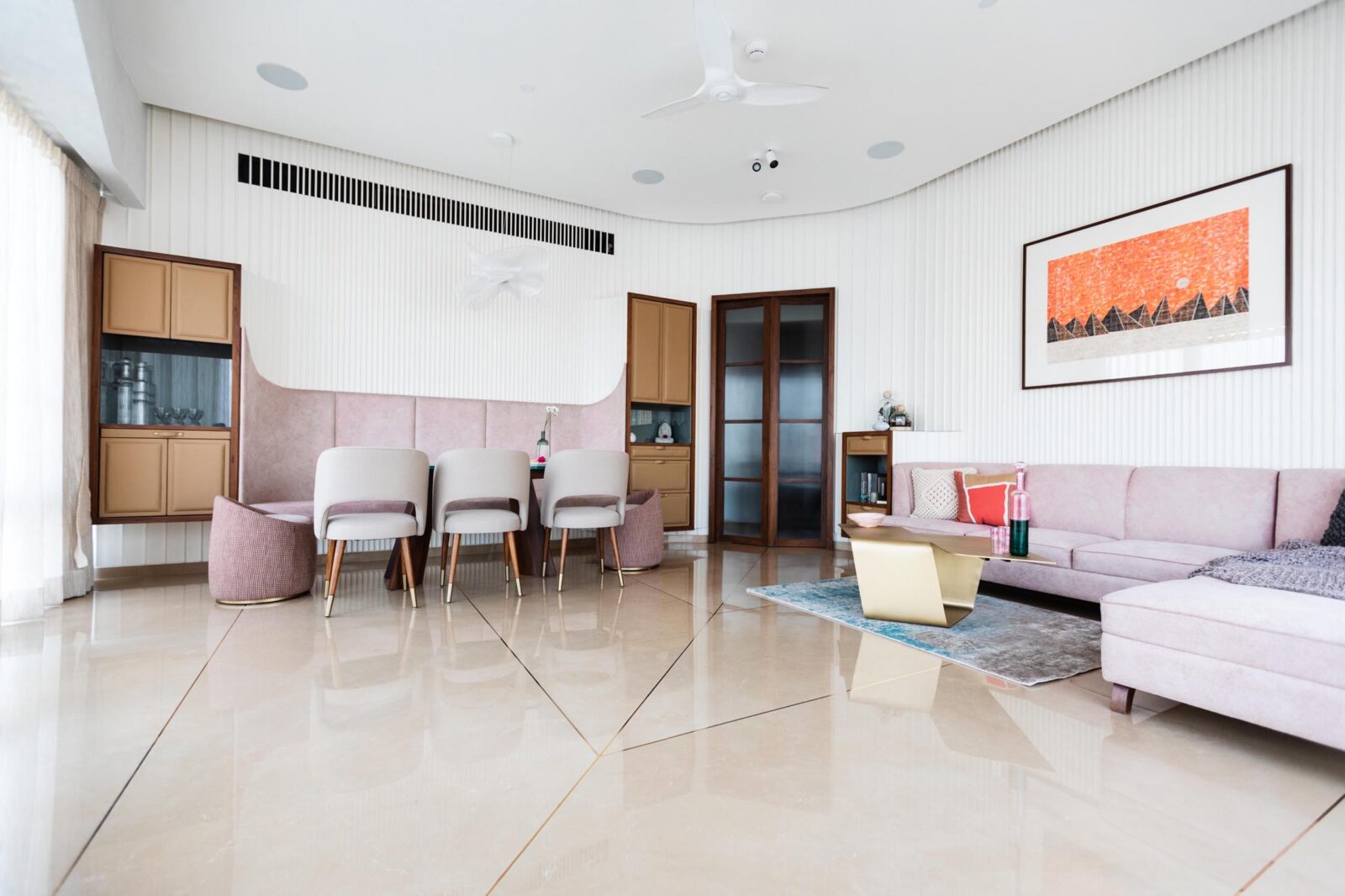
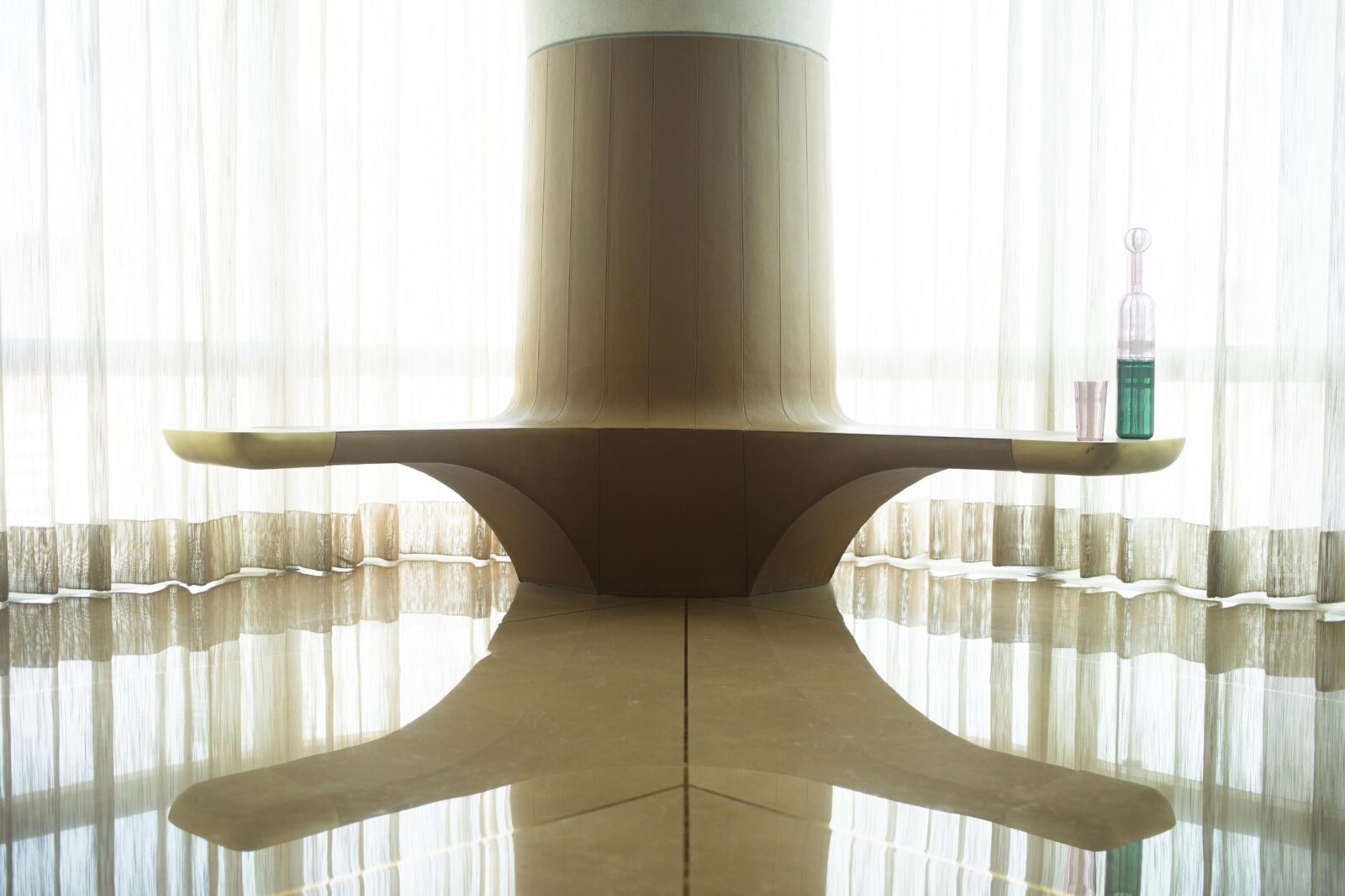
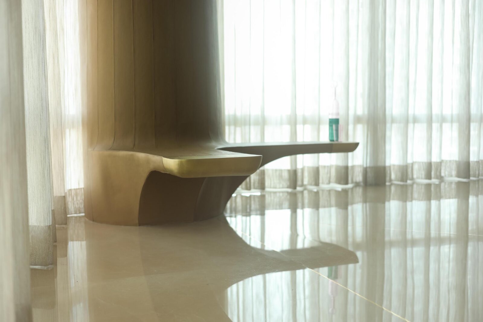
As another example, we encountered a circular column over 2’6” in diameter that was located in the living-dining space such that it was directly ahead as one enters the house. Not being able to do away with this, we embraced it as a focal point of the entrance and living area, framing formal and symmetrical views of it through portals and arches. A brass inlay in the marble from the entrance all the way across the house to the column works almost as a visual guideline, as if to say: This way please. The column was reinvented as an object of furniture by cantilevering benches off the side of it. The bench-column is clad in leather up to eye level and at the ceiling it is treated to blend seamlessly into the form and concrete texture of the ceiling that it supports. The end of each bench is capped with a removable brass cover that serves as a built-in side table.
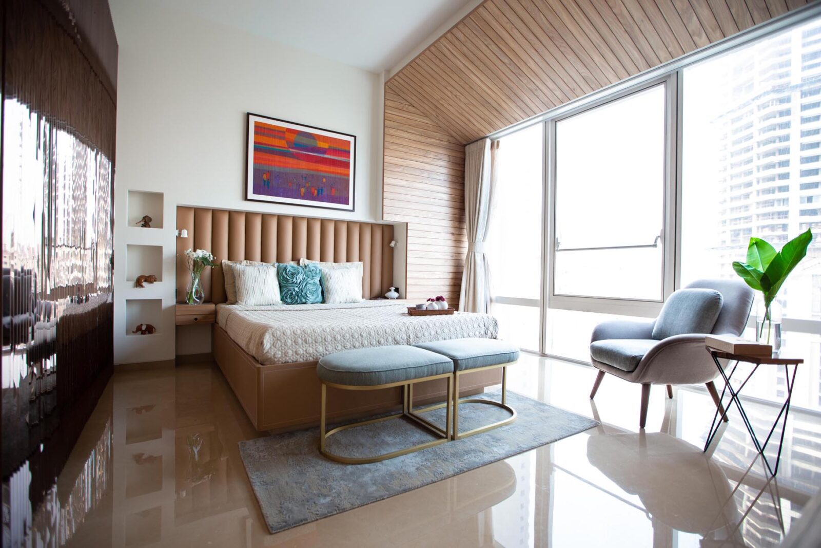
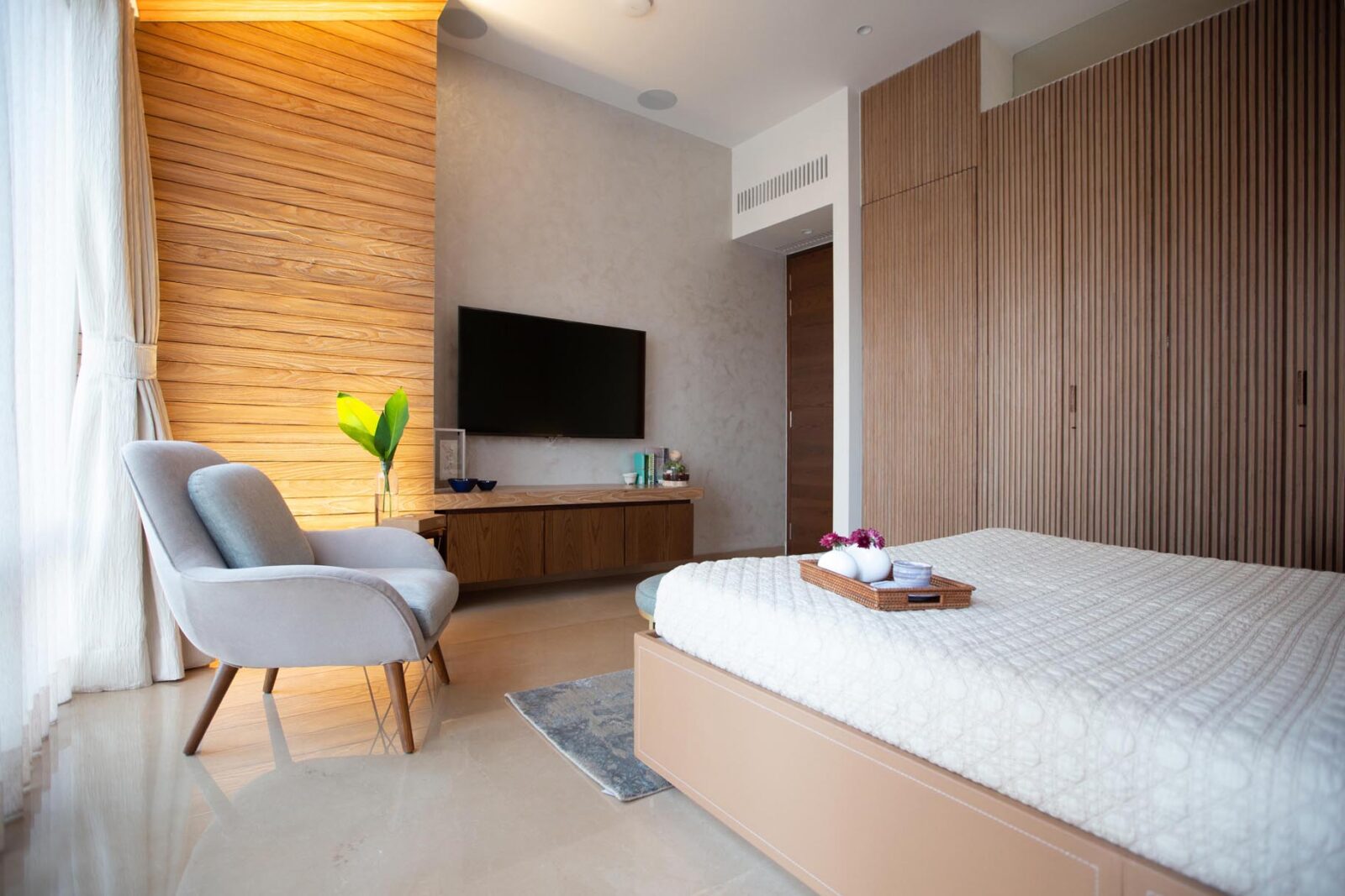
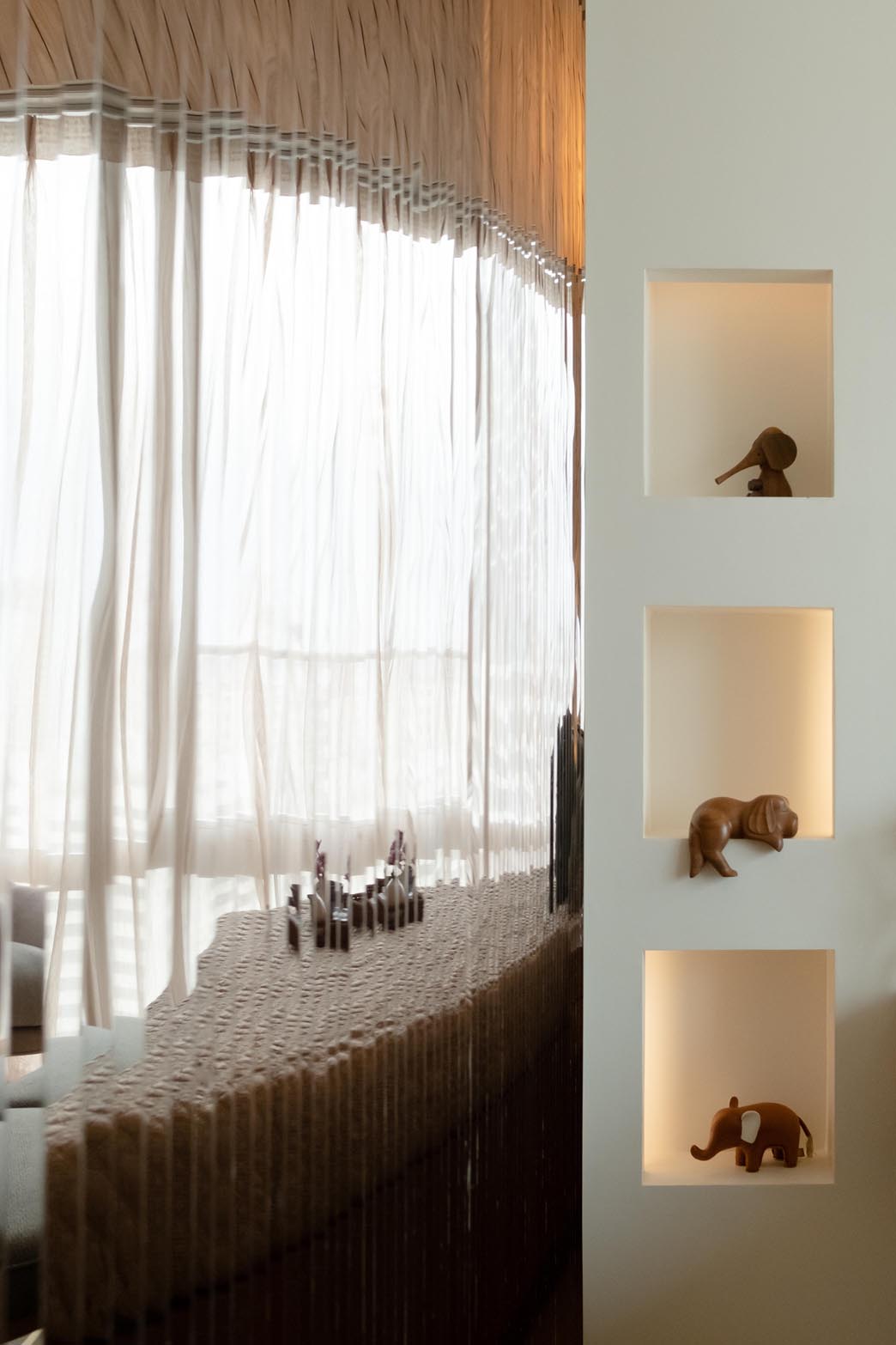
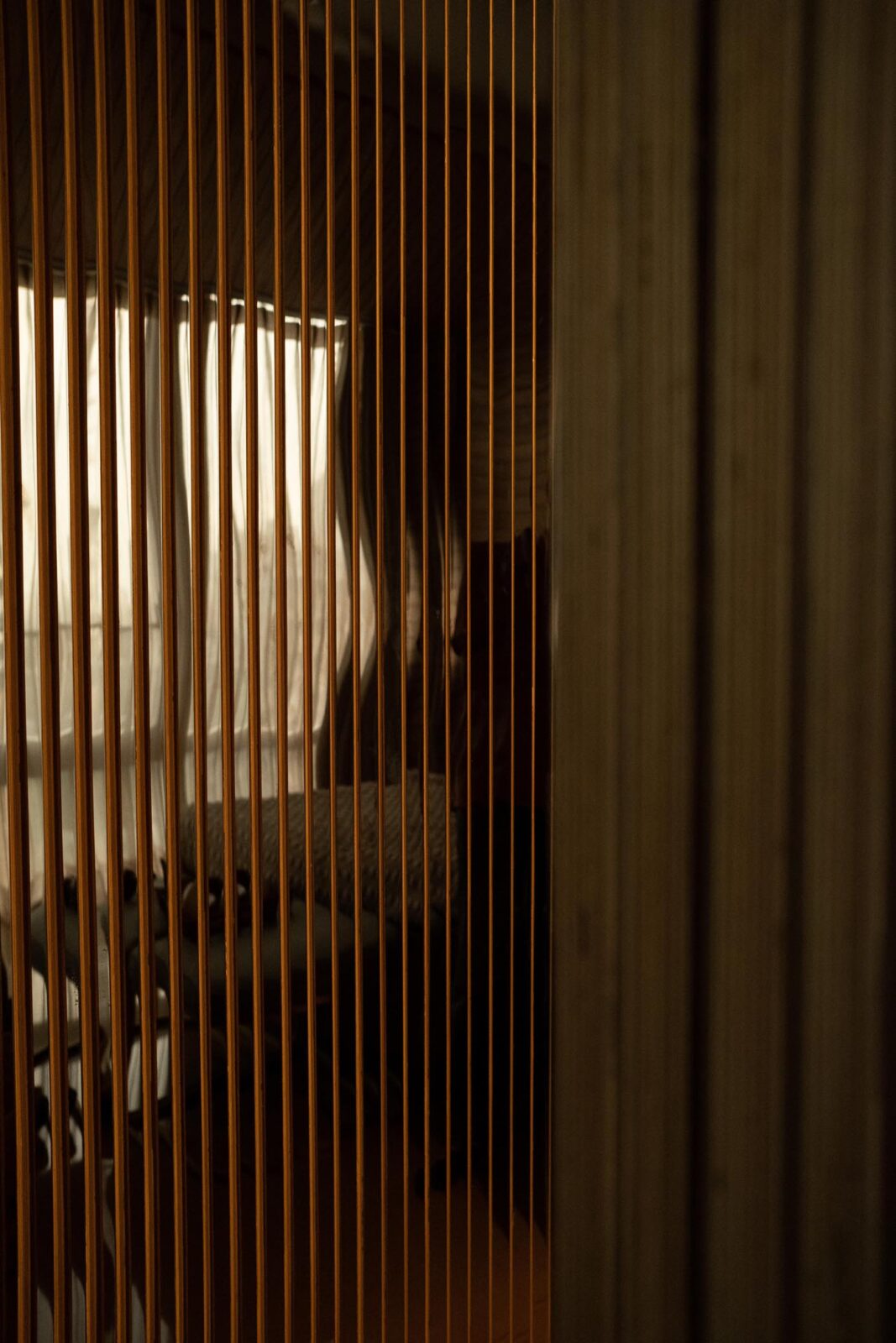
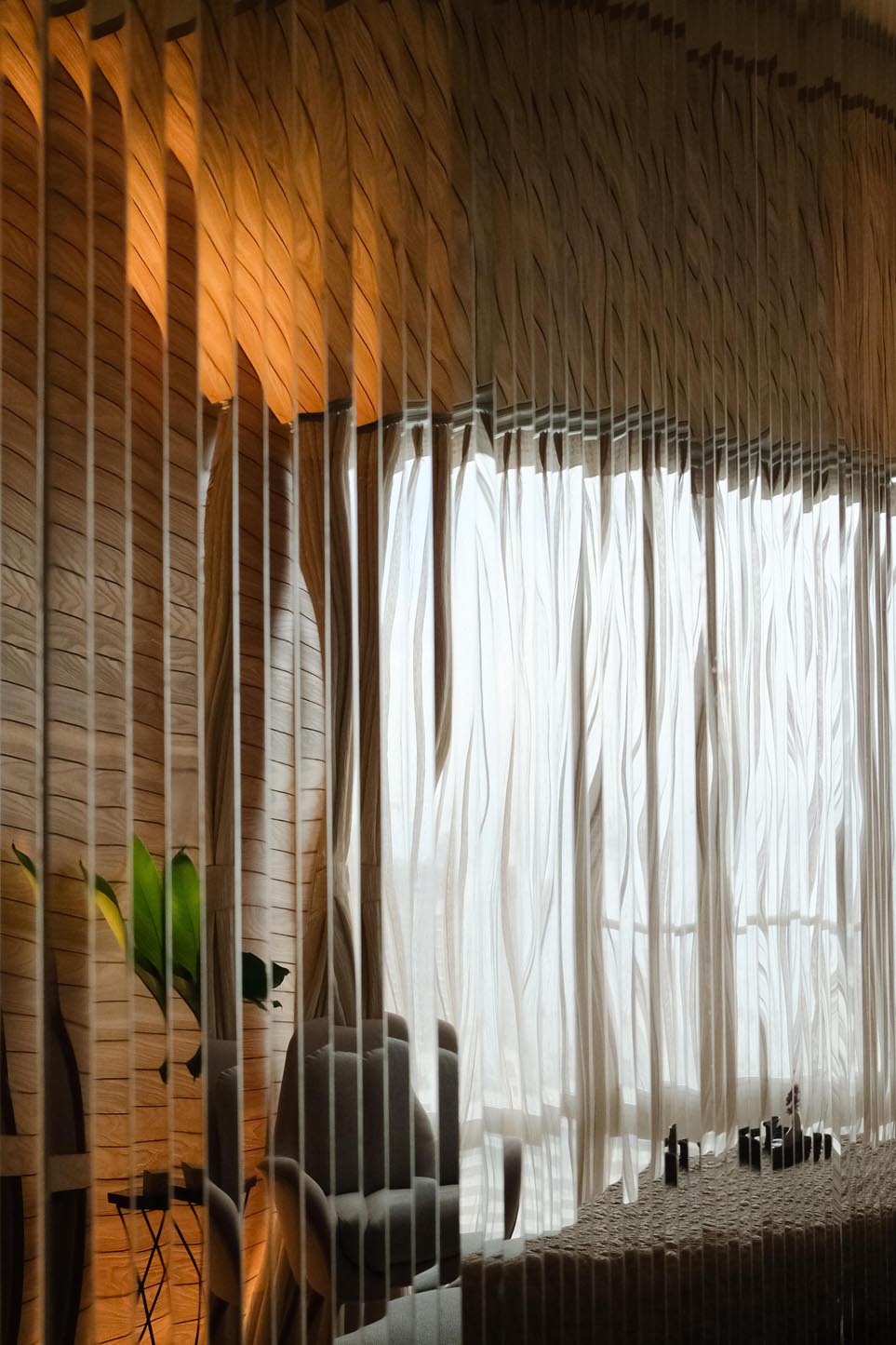
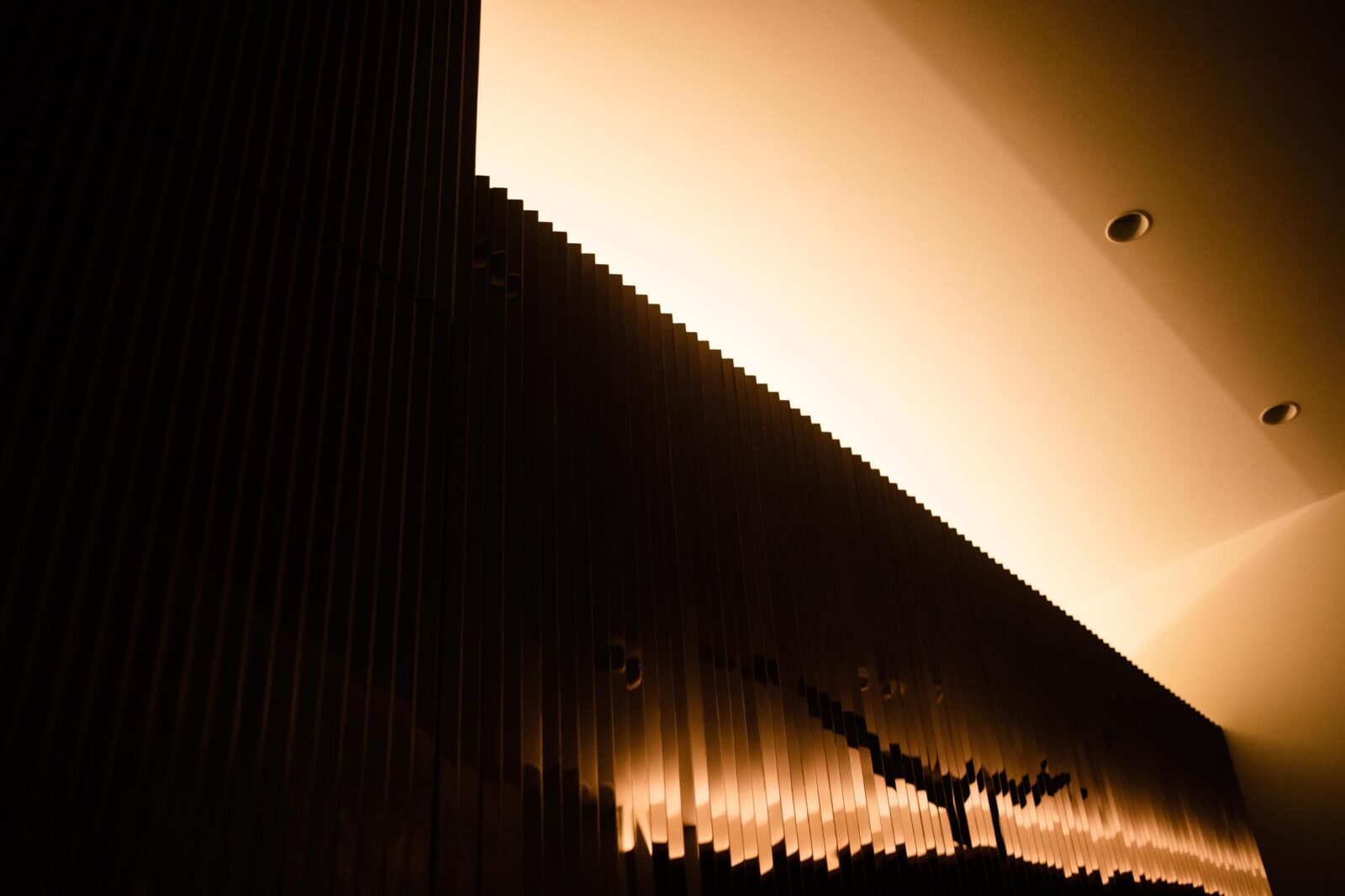
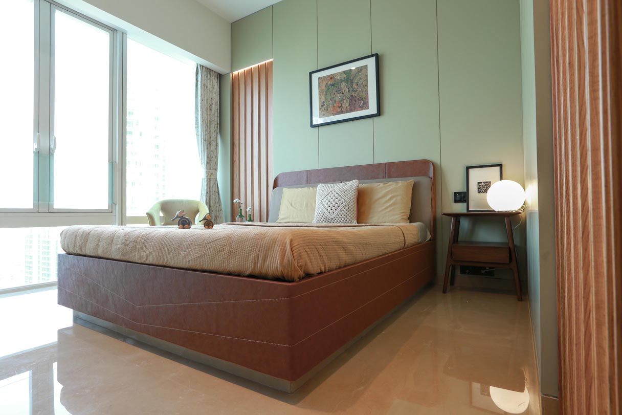
Or the master bedroom, where bemoaning the lack of a balcony, we created a sort of faux-verandah where timber cladding climbs from one wall across the chamfered ceiling and down the wall at the other end to define a zone that is within but also without, where planters and a lounge chair seem at home. The design of the wardrobe shutters in the master bedroom conceals the bathroom door within it and features triangular vertical cladding, in exposed edge birch ply with one face clad in stainless steel in gold mirror. Used in this way, these materials, vastly different in how they reflect light, result in what is known as a lenticular effect, where what is seen depends on one’s point of view. As a designer, not having wholly foreseen this effect in this manner means that one is still enchanted by walking across the room and being treated to a dance of faceted shadows and dynamic reflections – of the room and the skyline outside. (This is an idea that we went on to develop in a more functional way to produce signage on another project.)
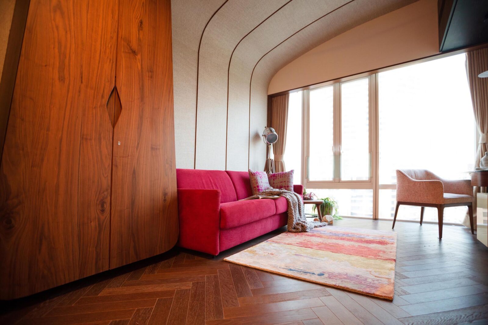
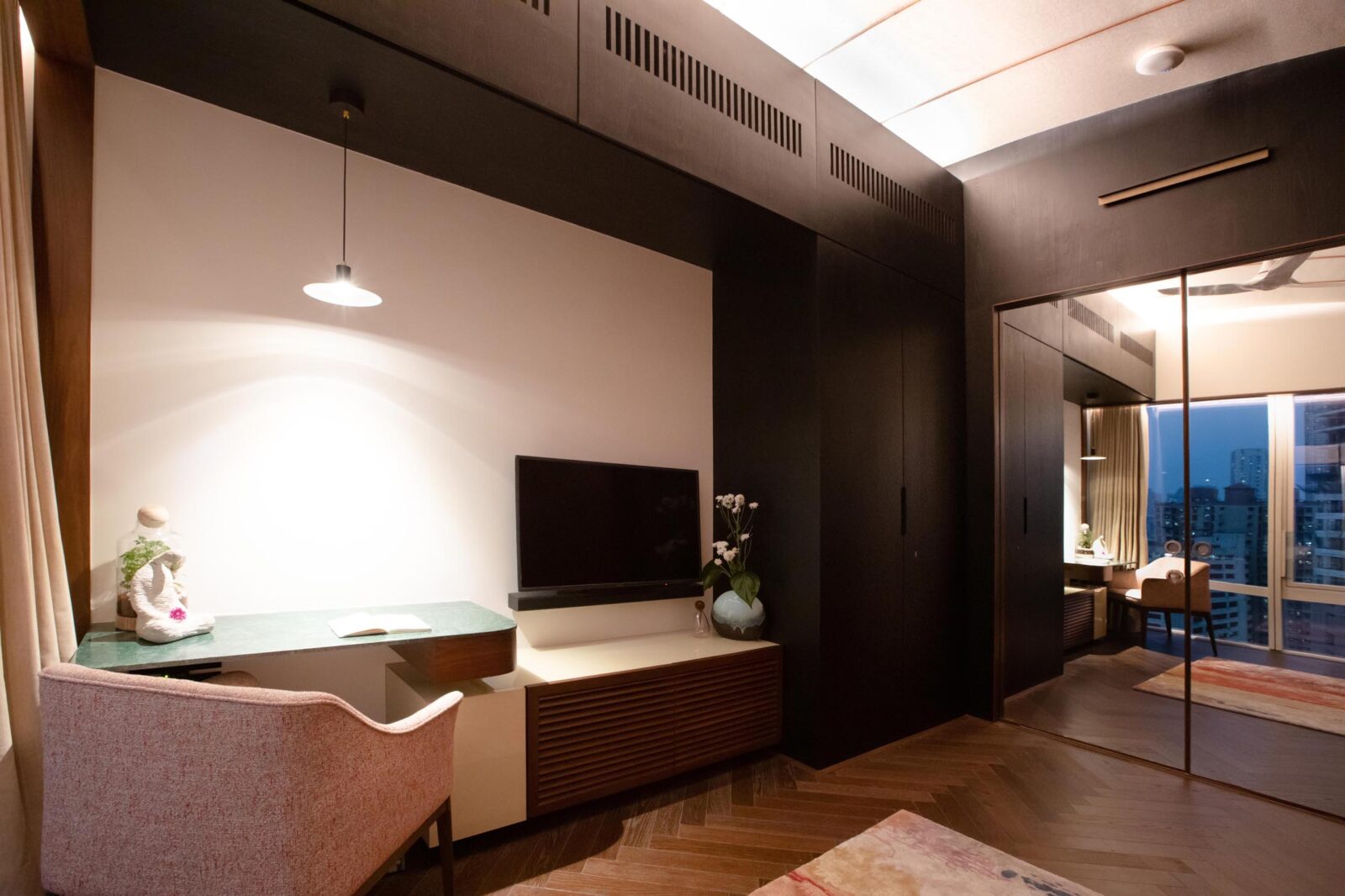
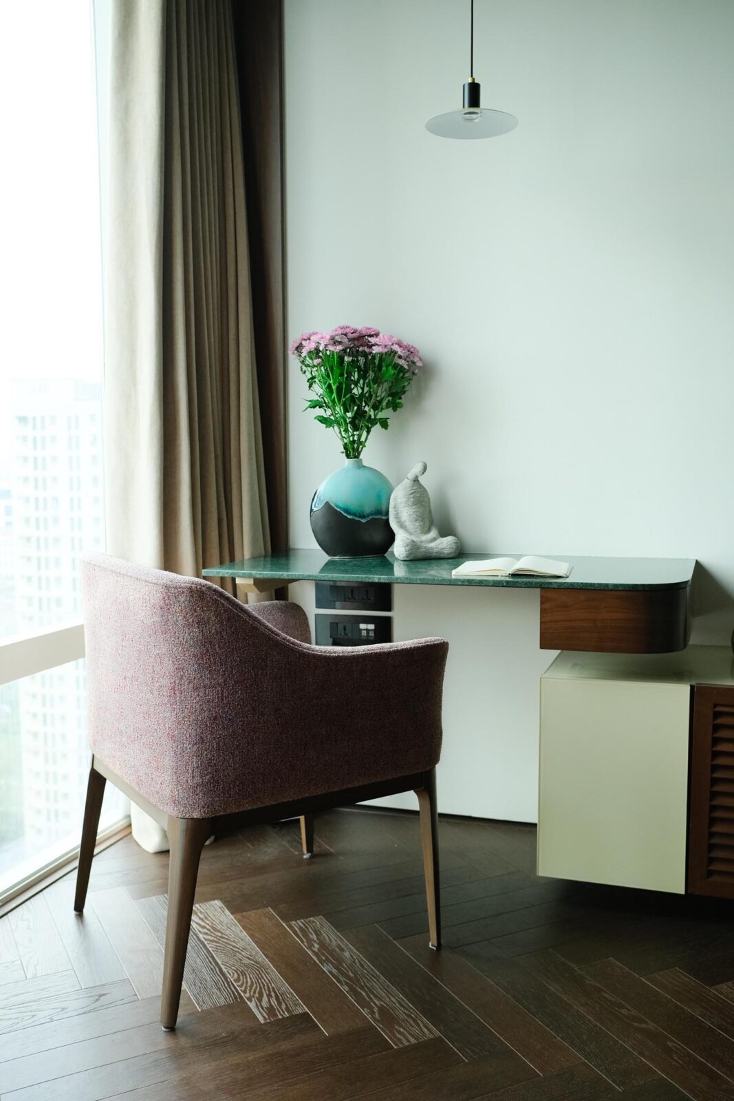
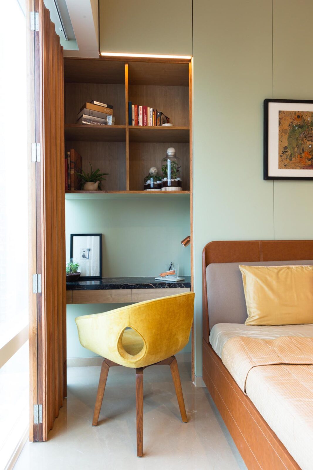
Especially in a city like Mumbai where space is limited, the flexible use of spaces is integral to our design philosophy, and comes across in in this home too. A largely unused guest room is designed to be used more as a TV lounge, with sliding doors that disappear into pockets to enlarge the smallest room in the house by opening it up into the passage and bring in much needed daylight to the innermost parts of the plan.
What started as a creative approach to addressing pragmatic challenges gives way to a process ending in spaces that evoke delight and – more importantly – a sense of home.
Design team: Pravir Sethi, Chintan Zalavadiya
Lighting design: Studio Trace
Photography & video: Studio Trace

